
React Native remains one of the most popular cross-platform app development tools. Aside from its growing global community and innovative libraries, React Native has given the freedom to JavaScript web developers to easily transition from coding complex web interfaces, to developing custom mobile native apps, using almost the same code. This single fact bears huge benefits to both developers and business owners in terms of app development costs and project timelines.
Among other challenges app developers have to face when building mobile applications is creating great user experiences tailored to platform-specific design and interaction. Fortunately, React Native UI design principles provide enough room for developers to adjust mobile apps to Android and iOS, with their different takes on the app design.
React Native UI Design
In this blog, we’ll cover the fundamental differences in UI/UX when creating a mobile app for iOS and Android devices with React Native, sharing the same codebase. When you’ve finished reading, you will have the confidence to design your UI components in a platform-specific way. So if you’ve ever wondered about how to design UI in React Native, buckle up. We’ll start by quickly reviewing the two mobile design paradigms (Apple’s and Google’s).
Android Devices and Material Design
In 2014, Google developed a design system called Material Design. The idea behind it was to digitally emulate the perception of material objects which have surfaces, edges, seams, and shadows. Material Design makes extensive use of the card motif in grid based layouts and encourages the use of animations, transitions, and using light and shadow to create depth. When you use apps like Gmail, YouTube, Google Drive, Google Maps, or any other Google apps, you will see Material Design in action.
Material Design Guidelines: https://material.io/design
iOS Human Interface Design
While Android makes use of the Material Design approach, Apple has their own Design Principles that govern what makes iOS apps outstanding. The three themes that drive great iOS UI are clarity, deference, and depth.
Summed up, this UI philosophy calls for a focus on content first and a thoughtful use of external effects, applied appropriately to bridge the gap between design and functionality. The use of layers and motions should aid in conveying hierarchy, while use of space, color, images, and other elements should subtly highlight important content whilst conveying interactivity.
iOS: https://developer.apple.com/ios/human-interface-guidelines/overview/themes
The images I use as examples in this article come from the resources that I include at the end.

The Platform API in React Native
Platform is a module that is shipped with React Native framework UI and allows us to conditionally render UI based on the current operating system that is running your application. This enables us to write Android and iOS code in the same components. Rendering an iOS and Android button based on the operating system would look something like:
 render( ) {
  return ( ) {
    <TouchableOpacity style={ Platform.OS === ‘ios’ ?
       styles.iosBtn :
       styles.androidBtn }>
      <Text>My Button</Text>
    </TouchableOpacity/>
   }
 }
In regards to the larger architecture of your app, creating view containers makes the tasks of rendering different components within React Native user interface, organized and easy to understand.
Read more about Platform API: https://facebook.github.io/react-native/docs/platform-specific-code.html
Navigation
Internal app navigation has a crucial impact on the overall app’s success. It is what determines how users get around and find important destinations in your app.
Android and iOS have two very distinct approaches to navigation. It is vital to plan the structure of your screens and how they relate, by deciding what the most important destinations are and how you think your users will behave when finding content. Keep in mind that Android has a built-in back button, and iOS does not, and usually makes use of a chevron “back” button in the navbar.
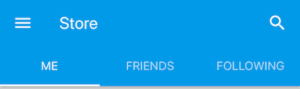
Android typically utilizes a drawer that slides out with options to navigate the top levels of your app, whereas iOS users are used to tabs at the bottom of the screen. Keep that in mind starting your app from scratch.
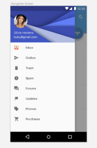
Android Drawer Menu
IOS Tab Bar
Tabs in Android apps will generally be at the top of the screen as opposed to the bottom like on iOS, though finding apps where designers use bottom tab bars on Android is becoming more common. (Tab bar on top still however is more ‘Androidy’).

Android tab menu on top
Android tab menu bottom
Buttons
There are three commonly used button types in Android. They all display ink reactions upon being pressed.
Floating action button, if you want it to be always available:

Android Floating Button

Android raised button

Android flat button
Placement of Android buttons:
- Forms – left
- Dialogs – right
- Cards – left
iOS buttons have a flat display
Flat iOS button
iOS button positioning:
- Dialog – center
- Card – wide, center
- Forms – wide, center
Secondary buttons have an inverted background color with a hint on the primary button’s color. When you come across this in Android, you will likely not see the border around the secondary button.
iOS primary and secondary buttons
Cards
Cards are a great way to communicate collections of content. They can be used with different data types and can have multiple actions while creating a pleasant user experience.
When creating React Native user interface on both Android and iOS, you need to account for the fact that cards have a drop shadow and border-radius. However, shadows will be a bit lighter and gentler on iOS.
Android card
iOS card
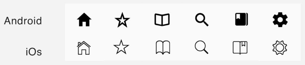
Icons
Choice of icons is something that truly can enhance the feel of your application, and once again, each platform embraces a different style. While it’s always possible to create your own icons within React Native mobile UI, it is important to keep the following approaches in mind.
iOS icons are likely to make use of thin lines, often with a transparent background color, whereas Android icons tend to be of a more solid nature, embracing thicker borders.
The following templates are taken from a great icon package from Expo called Expo Vector Icons, that is commonly used among React Native developers.
One can simply search for any icon and see corresponding choices for platform-specific inspired icons from a variety of popular open-source libraries like Entypo, Material Design, Ionicons and more. It also allows the developer to import icons as needed instead of loading an entire library.
Expo Vector Icons React Native app UI design: https://github.com/expo/vector-icons
Typography
Typography is something that is easy to overlook and can make a bigger difference than one might think when you design a React Native UI. Material Design is rather specific about line spacing and uses considerably more whitespace than iOS.
The general font for iOS is San Francisco and font sizes are not as drastically different from each other. In order to create a hierarchy between important texts, variants in font weights are more common than font size. On the other hand, when you make a user interface with React Native for Android, use more contrasting font sizes and less variation in font weight. Roboto works as the Android’s standard font.
In the following, take note of the space between the text, as well as the bigger, more striking text compared to that of iOS.
Android alert

iOS alert
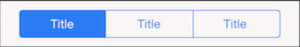
Segmented Controls
It’s hard to imagine React Native user interfaces without segmented controls. You could use segmented controls to alternate between content in a single view. Even though they serve the same purpose, their looks differ greatly.
Below you can see that each screen has options for alternating to additional content. Where iOS uses primary and secondary bordered buttons, Android places greater distance between each choice, no button and a simple line demonstrating activity.
Android segment controls
iOS segment controls
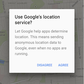
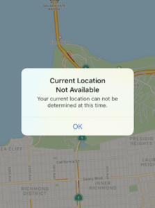
Alerts
Whether you are asking permission for tracking location, sending notifications, collecting data, or tasking specific actions that you want the user to follow, it’s important to get alerts right and to keep your user undisturbed from the experience. So when you build UI using React Native, take notice of these differences.
Most notably, the difference between iOS and Android alerts are the buttons. Android alert buttons are placed to the right of the container and exist as text only buttons, usually in all caps. iOS buttons are separated by dividers, with centered case sensitive text.

Android alert
iOS Alert
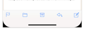
Action sheets follow a similar pattern, but have an increased variety of options to choose from. They originate from the bottom of the screen, overlaying the current view.
For android, you will usually use a solid colored sheet, often with a drop shadow to indicate a layer above the regular view. Icons next to the action text add a nice feel. iOS will have a slight transparency to color, centered text and divided and no icons accompanying the text.
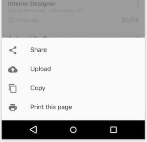
Android action sheet
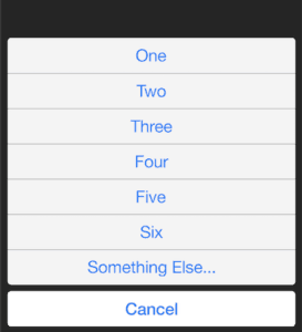
iOS Action Sheet
Things to keep in mind
Things change. As new devices and technologies enter the market, the way we approach styling changes. Style Guides are constantly updated to note the latest changes in layout and styling and there are great ways to benefit from reading through them every so often.
Exceptions can always be made in the way that we approach navbars, tabs, and alerts etc., and being creative and crafting great user experiences is our main responsibility.
Hopefully, this guide helped you as a React developer to define a mental picture of the stylistic differences when UI designing in React Native.
Awesome resources I used in this article that you can download for free
Design resources for iOS apps from Apple: https://developer.apple.com/design/resources/#ios-apps
Material Design Kit for Android:
https://materialdesignkit.com/android-gui/
Material Design Guidelines:
https://developer.android.com/design/index.html
iOS Human Interface Design Guidelines:
https://developer.apple.com/ios/human-interface-guidelines/overview/themes
Expo Vector Icons: https://github.com/expo/vector-icons
Related
- Flutter vs React Native Guide
- Cross Platform App Development vs React Native
- A Guide to Mobile App Frameworks
- Swift vs React Native: The Better Choice?