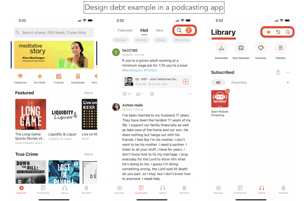
In software development, technical debt or design debt is quite common. In fact, design debt reflects the natural evolution of any product adjusting to market conditions.
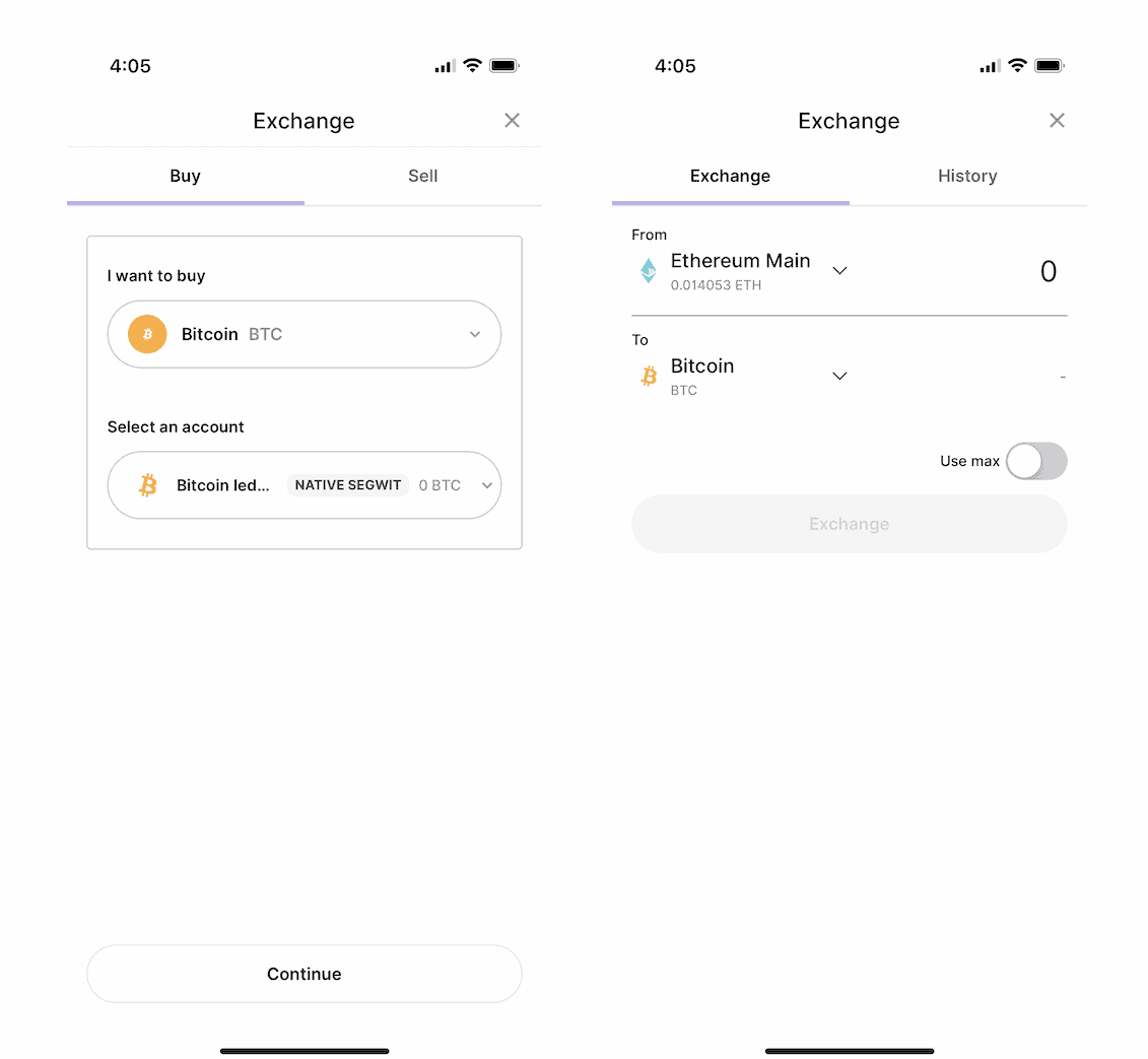
As customers, we rarely notice design debt UX issues. Still, even companies producing iconic products have to deal with design debt challenges sometimes. Only when drastic UI/UX changes find their way into a product do we notice them:

Let’s discuss how to tackle design debt before you need a complete app redesign.
Key Takeaways:
- Usually, design debt is a natural effect of an evolving software product iterating toward a perfect product-market fit. Still, it can also be caused by other factors. Therefore, it’s critical to start addressing such UX/UI issues early in the product development cycle by analyzing customer feedback and app usage analytics.
- You can head off design debt, to a degree, with strong leadership, close collaboration between designers, developers, and marketers, and an effective design system.
- A practical design debt management strategy includes planning, applying a holistic view to all interface updates, tracking known challenges, and allocating some time for gradual improvements.
Table of Contents:
- What Is Design Debt?
- 17 Common Causes of Design Debt
- Design Debt Impact
- Examples of Design Debt
- How to Avoid Design Debt?
- How to Tackle Design Debt If Your Product Already Has Any?
- How Does Topflight deal with design debt?
What Is Design Debt?
Design debt includes any UX/UI compromises we make when developing or updating a software product, whether a website or a mobile/web application.
Take a look at these headers from different pages on our site:
That’s precisely how UX debt can manifest. We’re focusing on helping our partners succeed at the expense of updating a couple of old pages on the site. Is it bad? The site still works, and visitors can get anywhere they need.
It’s just these little things tend to pile on and, if not taken care of, can snowball into massive user experience degradation.
Design debt vs. poor design
At the same time, you need to differentiate between product design debt and poor UX. Inadequately designed software struggles to generate traction, and its owners owe a complete redesign to remain become competitive.
On the other hand, design debt is a prerequisite of successful digital products that have already won a fair share of customers but have experienced a slow decline in new onboards, conversions, and other vital metrics.
Also Read: UI/UX design tips to build a winning application
So only when you start noticing a downward trend in your product performance do you know that you’ve generated a substantial UX/UI debt. Typically, you’d find this adverse effect in one of these areas:
- User interface (varying buttons, forms, icons, and visual styling)
- User experience (animations, screen transitions, etc.)
- Overall information architecture (inconsistent navigation, duplicate info, content categorization)
Check out the icons and an inconsistent use of titles (always loved the app, but always felt its UI is weird – that’s how customers perceive UX/UI debt)
- Missed accessibility optimizations
- Inconsistent copy (including UX copy)
- Cross-platform inconsistencies (e.g., different search filters in web/mobile UIs)
17 Common Causes of Design Debt
Broadly speaking, the main reasons for design debt have to do with how we practice UX/UI overall and can be divided into natural causes (a team is aware of the fact) and forced causes (external factors cause the debt).
Natural (aka intentional) causes of design debt
- rushed time to market
The budget/time struggle is the most common reason designers take shortcuts. “We’ll figure this out later,” “We just need to launch,” and “Users won’t even notice” — are all typical arguments in these situations.
- experiment-driven design
Startups often fall into the trap of iterating super fast, cutting corners on technologies and user interfaces. These experiments can quickly accumulate into a product design debt on our way toward optimal product-market fit.
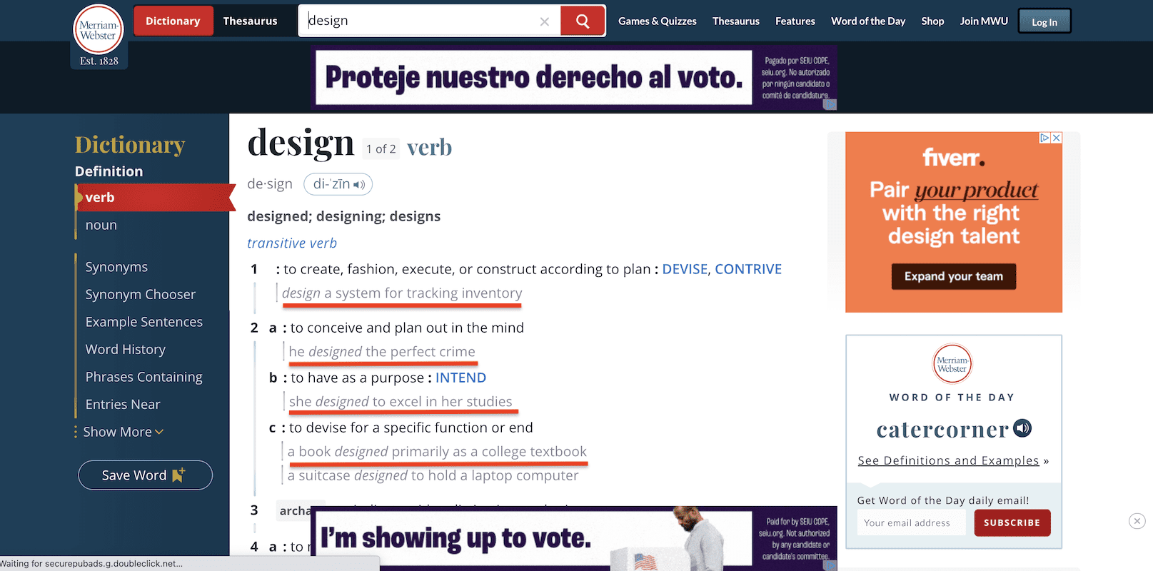
- accessibility shortcuts
Let’s be frank: optimizing apps for accessibility takes a significant effort, so companies often implement half-measures and wait until a product matures to add advanced accessibility options.
- ready-made UI templates
Using ready-made templates without customizing and unifying their look and feel naturally results in UI/UX inconsistencies (for example, different ways to show context help or varying screen transitions).
General design practice patterns causing design debt
How you run UX/UI engineering at your place and whether you follow best-practice patterns can also affect a product’s visual congruence.
- limited product vision
Granted, it’s laborious to think through all possible features for specific products. However, if you’re developing something like an e-commerce app, the lack of clear vision virtually guarantees look-and-feel issues as the product evolves.
- not enough user testing and market research
Some product teams prefer to decide everything for customers, which can be very costly. And a moderate design debt, which doesn’t call for a complete UI overhaul, is the best-case scenario in this case. Well-tested products have very little design debt, if any.
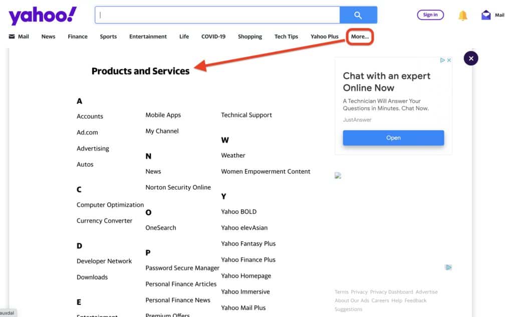
- distributed nature of design teams
If there’s more than one team working on a product’s interface, effective communication becomes essential.
- not following Apple’s / Google’s guidelines
It goes without saying that your UX engineers should be familiar with the mobile industry’s best practices to come up with a viable solution. Clearly defined SOPs for onboarding new designers and documentation certainly help with that.
- poorly maintained or no design system
When maintaining a design system, we should always refer to existing assets, ensuring all new elements don’t add overhead and unnecessary clones. This way, the design remains consistent, and we avoid operational design debt (outdated files).
- a disconnect between designers, developers, and marketers
Designers being detached from the user engagement analytics results in a poor understanding of UX/UI performance. And when designers and developers ignore each other’s feedback, it only worsens things.
External factors forcing design debt
Finally, design creep challenges can be caused by something out of your control.
- gradual horizontal scaling
After gradual horizontal scaling, as you build features one by one, you’re still likely to hit a wall when new UI/UX is required — it’s just a matter of time. And it doesn’t have to do with obscure product vision because products can pivot to find their product-market fit.
- support for new hardware
Here’s a good example: when Apple released the latest Apple Watch, all developers got extra space on the screen that they could choose to ignore or optimize for.
- UI/UX paradigm shifts
Unfortunately, when companies like Google set a new bar for the UX/UI, e.g., by introducing Material Design, your design debt can pierce through the stratosphere. Fortunately, these changes (like Apple moving away from skeuomorphic patterns) only happen sometimes.
- changes in tech requirements/ tech stack
The UX/UI goes hand in hand with underlying technologies, so changing a tech stack can have a cascading effect on the app’s look and feel.
- change of the context for using a digital solution
Is the interface consistent with the environment for using an app? For instance, a medical app can decide to serve not only doctors but also nurses.
- fear of irritating customers
Everybody knows that customers hate changes and grow accustomed to even not ideal designs.
- merging with other software
Both products or one of them will need considerable updates to keep the UX/UI smooth.
Related: Health App Design
Design Debt Impact
As already mentioned, the main negative effect of product design starts to feel when you notice a downward trend in crucial app performance metrics. What other casualties can we expect when not addressing piling-up UX/UI issues?
Brand damage
Customers may leave at some point, and you will need to spend extra resources to get them back to using the same or other products by your company. That’s because they may have a strong negative association with your brand from their previous experience.
Low traction
People are likely to switch or choose other software offering a compelling customer experience if we don’t treat design debt in time.
Missed business objectives
As a result, the software struggles to hit target KPIs.
Demoralized teams
Consequently, UX/UI engineering and development teams may feel exasperated when too many seemingly small changes require too much time to address.
Slower product evolution overall
Finally, we may face stalled growth, being unable to introduce new features at the desired pace.
Before we discuss how to counteract design creep leading to these challenges, let’s look at some practical examples of designers getting into debt.
Examples of Design Debt
Let’s look at some real-life examples of design debt. Here’s an iOS mobile app by a popular task management system called ClickUp:
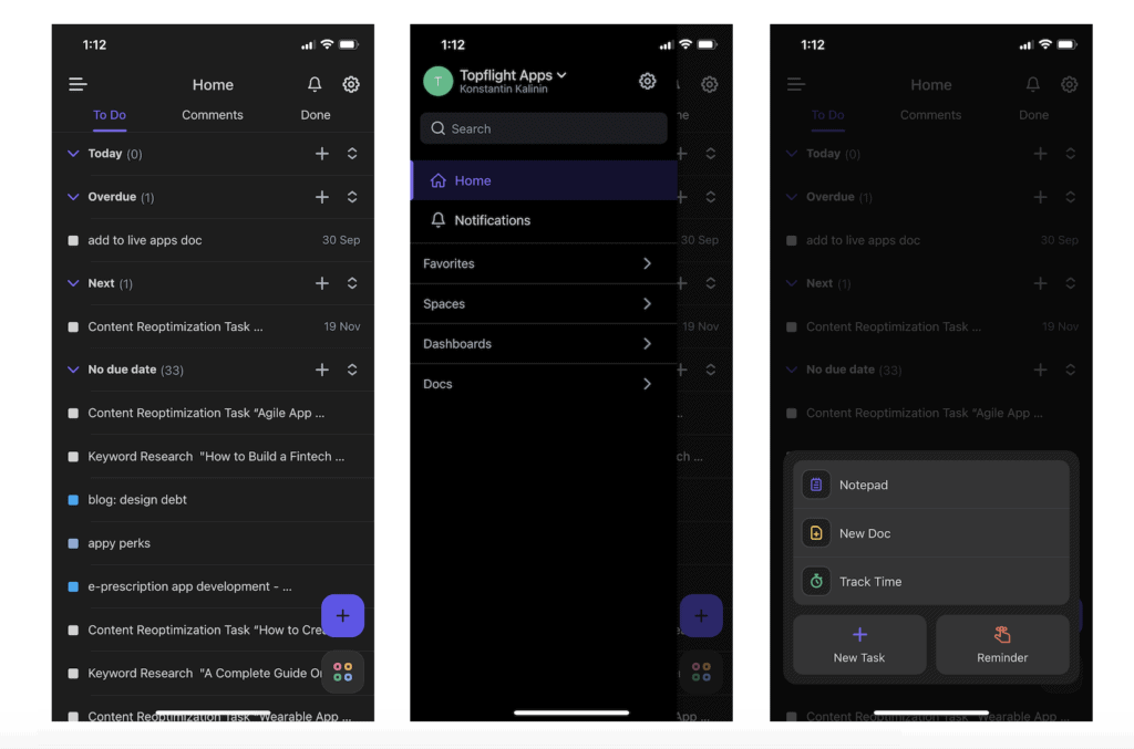
First, the app misses the standard iOS navigation — no bottom tabs. Instead, it copies the Android-styled tabs at the top (To Do, Comments, Done) and the hamburger menu. Second, it uses floating buttons for key features (that get away from sight when scrolling), like in Android’s Material Design.
Why don’t they use standard iOS navigation patterns? Because the app is built with Flutter — Google’s cross-platform app development framework, which slightly favors Android by providing lots of reusable templates. In other words, ClickUp can release new versions of the app faster without tinkering with the UI/UX on iOS and instead uses a universal look and feel across both platforms.
Some of you would say that this hardly qualifies as design debt because ClickUp must measure app usage stats and gather customer feedback. Everybody must be happy with the way the software looks and feels. At the same time, this non-conventional interface paradigm makes iOS users learn a few tricks.
Here’s another example from the same app that lies on the edge of technical and UI debt:
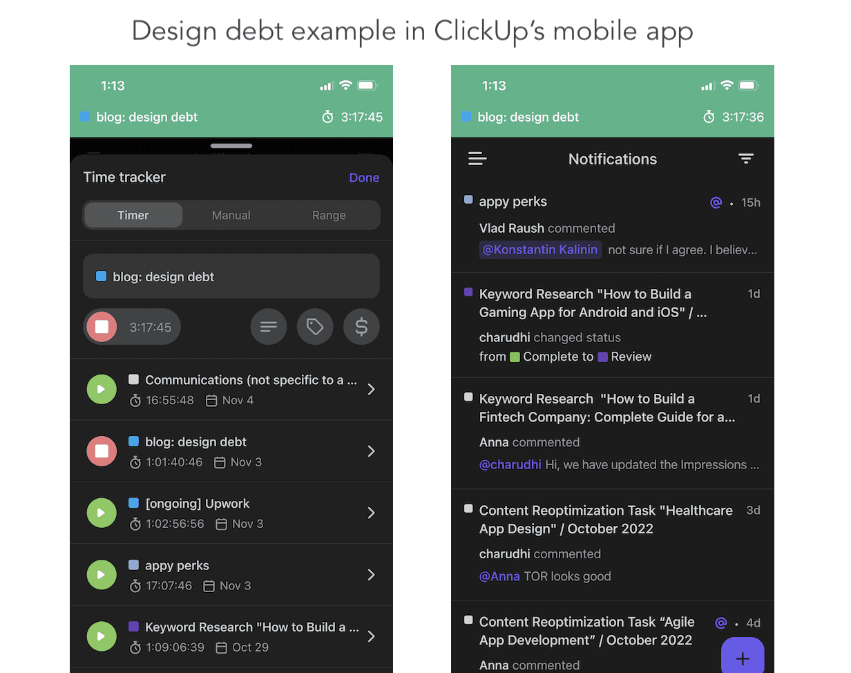
Also, if you noticed, they have duplicate controls for stopping the current task on the time-tracking screen. As a savvy user, I must say it’s very confusing, especially if you try these red buttons in action — it takes some time for the UI to respond. You never know if you stopped the timer for sure. I have to exit and go into an app again to double-check every time. Imagine the fury when they fix this lovely routine that’s been growing on me (just kidding).
Related: Mobile App Design Guide
How to Avoid Design Debt?
In an ideal world, the software wouldn’t have any design debt. However, as we already noted, this phenomenon is common even among incumbents with lots of resources. Therefore, the mission becomes to minimize rather than avoid design debt altogether. Otherwise, competition will leave us far behind, taking advantage of our prolonged time to market. So how do we solve that?
Planning
The best way to prevent design debt accumulation is by meticulous planning. Look at the product holistically and envision its evolution path: what are some possible bottlenecks in the design process?
Then, remember to allocate some time in future development sprints for slight changes that would keep the software’s UX/UI integrity.
Thus, planning helps us mitigate potential risks in advance.
Audits
Run interface audits and design system audits periodically to proactively notice potential discrepancies. Depending on your development velocity, you can run such audits every three or four months.
Leadership
A solid design leadership that can also listen (especially when several teams are at work) is critical to keeping tabs on accumulating design debt.
Team culture
How well development and design teams collaborate dramatically affects how many UX/UI revisits will be necessary over time.
Effective tools
Use effective tools like Figma for managing your design system or even design hand-off dedicated tools like Simpli.io or Storybook. Such component-based UI libraries help establish a common language with developers.
Related: How much does it cost to design an app?
How to Tackle Design Debt If Your Product Already Has Any?
Let’s hope you don’t need a complete redesign because that would mean your design debt has grown out of manageable proportions. Still, if you’ve identified that user satisfaction metrics are declining and customers are increasingly complaining about their experiences, how can you remedy this?
Step #1: Scan and prioritize
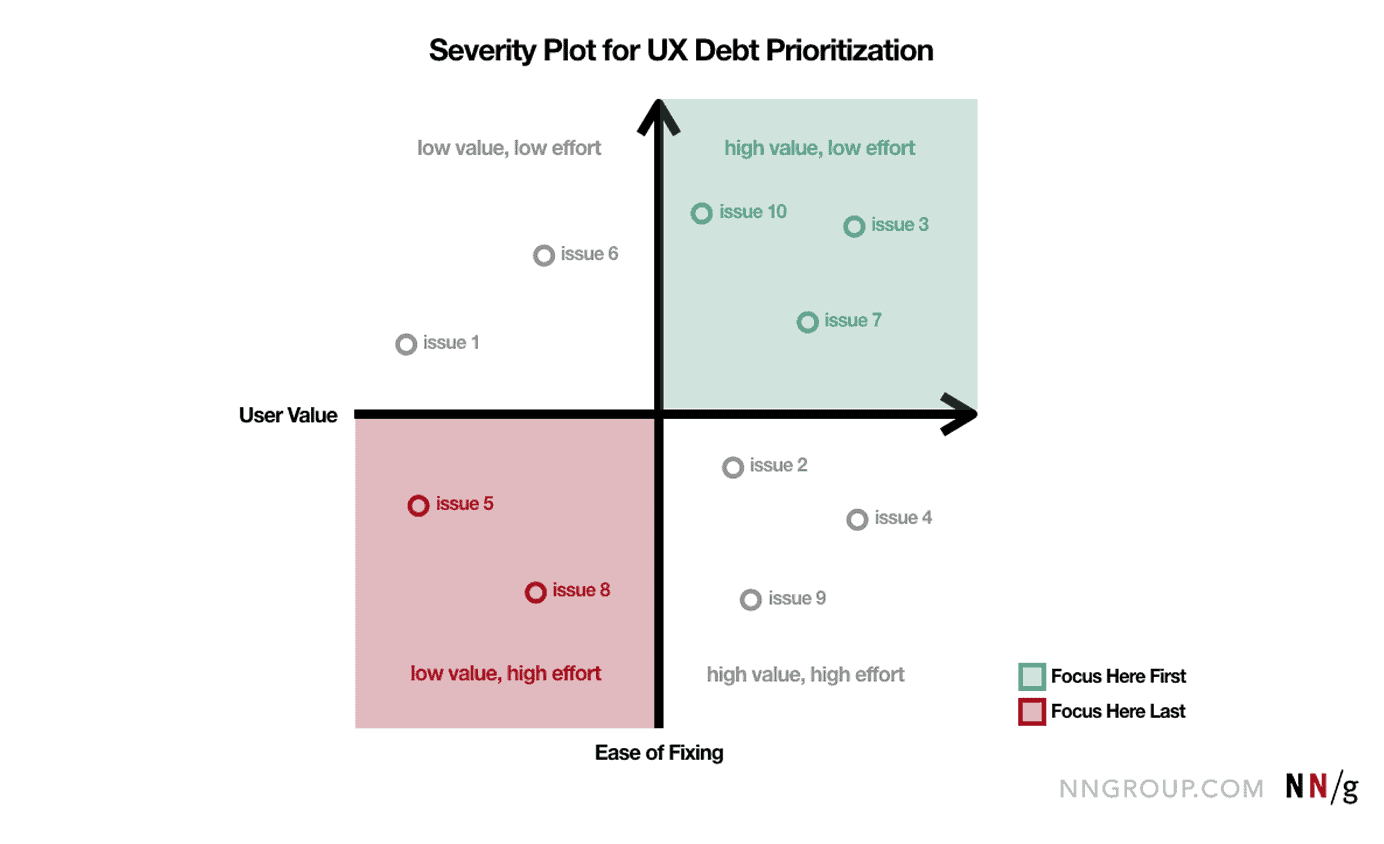
The first step is to run an audit, identify all UI/UX inconsistencies, and prioritize them. We need to go after low-hanging fruit, meaning UX/UI changes that are likely to impact ROI the most while requiring fewer resources. That’s why it’s essential to measure design debt first by comparing the possible positive effect vs. the cost of implementation.
Image credit: Nielsen Norman Group, (all rights belong t0 Nielsen Norman Group)
Step #2: Execute
Typically, these will be the most noticeable changes in customers’ experience, even if users struggle to identify them.
We need to allocate some time for these ongoing changes for all future sprints because we know that design debt will always be present in some capacity. It’s best for the user experience to attack such UX issues gradually than in one go.
Updating too many design inefficiencies can cause backlash from customers who are already used to working with our app in its current imperfect form.
Step #3: Track design debt
Finally, we must track and manage design debt going forward transparently. This, in turn, implies that we know about all design trade-offs we’re willing to make and keep them in a special place.
Ideally, we keep a separate design backlog instead of storing all these issues in a general design backlog, where they can easily get lost in the sea of planned updates and other fixes.
In addition to grooming the UX backlog, we should closely monitor in-app user engagement using analytics platforms like Mixpanel or good old Google Analytics. This approach will ensure we’re on top of things before they collapse.
Some companies even develop design debt calculations to stay in control, calculating the “interest” they will have to pay later.
How Does Topflight Deal with Design Debt?
Usually, we face UX/UI debt when we work on a rushed product, or if our partner comes with a half-baked application. If a partner is rushing the development, we put out guards in the form of rapid prototyping — creating a graphical shell of a product and testing it with customers before starting to code.
If we have to work with a “ready” design created by freelancers or other UX team and we see deficiencies, we run an audit and plan for a facelift.
Here’s an example of design debt we have in Walker Tracker (highlighted): basically, asking the user to complete an action before explaining an option.
Of course, we’re not perfect, and working on some cutting-edge projects, we have to make compromises sometimes. The resulting design debt gets tackled during development sprints, one step at a time, but only if that doesn’t involve too many code changes.
A few things we’ve learned over the years:
- design debt is never addressed on rushed projects until a complete redesign is in order
- shared responsibility for the UX decisions between our team and partners is a must
- push back with data and customer research findings when necessary
- a design system is critical for a successful project
- most successful products have manageable design debt
Book a call with our experts today if you need help tackling a design debt problem.
Frequently Asked Questions
How is design debt (DD) different from tech debt (TD)?
DD is about UX/UI inefficiencies and discrepancies, while TD has to do with sloppy code sacrificed for the sake of faster time to market. At the same time, TD can sometimes be the reason of DD, for example, when designers can’t use native UX patterns or UI elements due to coding shortcuts. TD calls for code refactoring and DD for UX/UI updates or a redesign.
How long does it take to mend UX/UI issues caused due to design debt?
Individual for each case. The ideal practice is to assign some percentage of all sprints to temper interface inconsistencies, which can be 10 to 20 percent depending on how much the debt affects the user experience and the amount of the debt itself.
What's the best approach to tackling design debt?
The best way to pay off your design debt (DD) is by fixing the issues that instantly add value to customers. It doesn’t make sense to attack DD by applying minor changes first because they affect customers’ experience the least. Always focus on what improves the UX and ROI at the same time.
How come design debt is unavoidable?
Design is a very subjective notion. We do our best to back up our UI/UX assumptions with user testing and market research. However, after all is said and done and the software launches, it becomes available to a much larger audience. That’s when we start receiving much more customer feedback, which we must act on swiftly to curb potential design debt and base our further assumptions on a much larger (and growing) data set.
Is it possible to eliminate design debt completely?
No, but you can keep it to the minimum using the steps described above. Design debt will eventually slip through because you must prioritize time to market when launching new features. However, knowing that you introduce these small UI/UX inefficiencies will make it easier to update the look and feel of the app during the next update.

