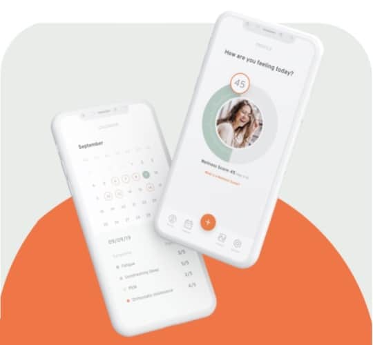
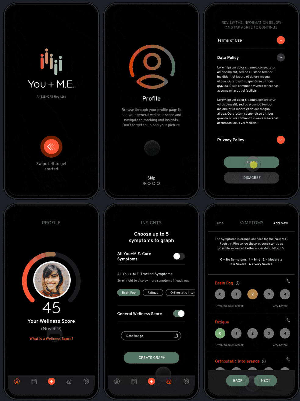
Let’s take a look at the two healthcare apps we built:
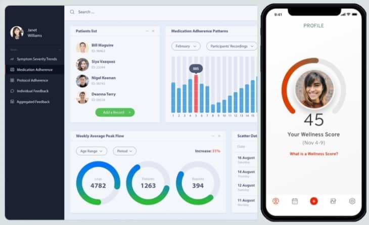
The medical app UI designs here are clearly poles apart, and for good reason:
- Target audience: healthcare providers vs. patients
- Purpose: manage clinical trials vs. track symptoms
- Platform: desktop vs. mobile
I can go on, but I’m sure you get the point. Health app design can be completely different, depending on who, why, and how uses the app and also other factors like the healthcare app development budget, technology stack, and more.
If you imagine all potential combinations of whos, whys, and hows, you can’t help but wonder, “Is there a way to design a healthcare app that would appeal to everybody?” I’m happy to share how we tackle custom healthcare app design at Topflight, working on a variety of different health apps.
Top Takeaways:
- Designing an engaging, effective medical application involves both UX and UI, which work together to empower your customers and let them reach their goals faster.
- Healthcare app UI design needs to be cross-platform. When you design a healthcare app, you create software that will live in an ecosystem and eventually will span different platforms.
- Remember to always test your medical app design assumptions with a prototype by giving it to real users from your target audience.
Table of Contents:
- Critical Aspects of Health App Design
- The Best Examples of User Interface Design for Healthcare Applications
- Challenges for Healthcare Mobile App Design
- 9 Steps of Medical App UI Design Process
- Cost of Healthcare App Design
- mHealth Design Best Practices
- Healthcare App Design Trends in 2023
- Our Experience in Medical App Design
Critical Aspects of Health App Design
The bad news is you can’t design a healthcare mobile app that appeals to everybody. The good news is if you genuinely know who your customers are, why they need an app, and how they are likely to use it, you’re on the right track.
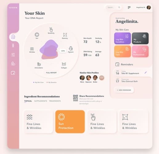
Let’s quickly discuss some design fundamentals, though, before we start talking about all the things you need to consider when designing a successful healthcare app. This mini primer will help you have a constructive conversation with your app development team when working on health app UI design.
UX/UI 101
Okay, so real quick — UX and UI, despite being often used as a single term, actually mean two different things. These two things need to work together for a medical application design to perform as expected.
UI, or user interface, is everything the user sees in a health app.
UX, or user experience, is everything the user experiences in a health app.
They both work together because any health app is dynamic in its nature — screens transition, buttons animate, menus open, etc. It’s no wonder then that the UI influences how users feel about interacting with an app, and the UX in healthcare apps dictates how the health app interface must look.
Related: The Ultimate Guide to UI/UX Mobile App Design
In other words, you can’t design one or the other separately. Both the UX and UI of an app emerge at the same time as you design a mobile healthcare app. However, you still need to balance the two. At Topflight, we use a user-centered design to achieve that.
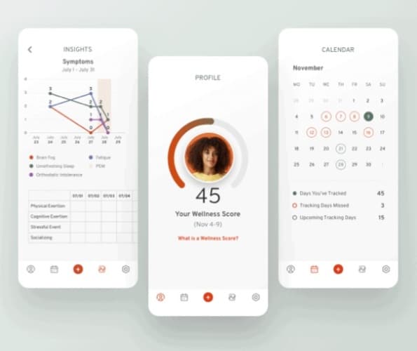
The user-centered approach to designing a healthcare app implies putting your customers front and center when thinking through healthcare app design mechanics. In other words, you need to know your target audience inside out.
That’s it. I’ll get back to target audience research when we start discussing the steps of designing medical apps. Right now, we can talk about all the things that go into planning a winning healthcare app design.
Esthetics
Apple and Google have spoiled us with their state-of-the-art app designs. I can hardly imagine someone keeping an app with a lackluster design when there are so many alternatives.
Of course, the healthcare industry itself, and hospital app design in particular, hardly sets UX/UI trends. Healthcare apps are not the top categories in Google Play and the App Store by any means. Still, an app’s look and feel plays a crucial role in how long the mobile software will stay on a user’s device.
Here are the things you and your team will need to consider to design an esthetically pleasing healthcare application:
- colors
- fonts
- iconography
- logo and branding
Together, all these things need to set the right mood for customers to enjoy using your application. I won’t go into the details of the color theory and remind you how a calligraphy class taken by Steve Jobs in the days of yore influenced Apple’s products. There’s a lot that goes into crafting a beautiful health app.
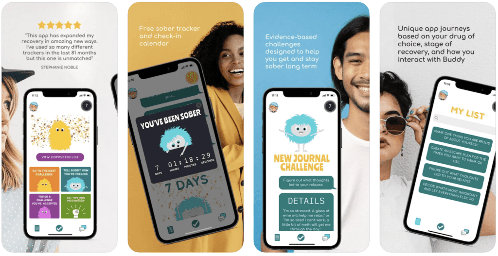 Image credit: App Store, SoberBuddy (all rights belong to Apple Inc.)
Example: Should you use a universal cross-platform font that reads great on mobile, desktop, and other devices, or should you pick individual fonts for each platform while working on a health care app design?
Navigation
Besides a pretty health care app UI, we need a navigable user interface design for healthcare applications. As you know, to get things done in a mobile solution, we quite often need to jump between a few screens. Therefore, well-thought-out navigation helps users achieve their goals faster and makes them feel in control.
Essentially, at any given moment, users need to know where they are in the app, how they can return to a previous point, and how they can reach other app sections. Some of the options for crafting an easily navigable app include:
- hamburger menu
- tab bar
- topbar
- UI cards
- tabs
- gesture-based navigation
Example: How much information can we fit on this screen before moving the rest to a new screen? Can our customers accomplish the main tasks in three taps? Does our digital health app design respect the established navigation patterns of our target platforms?
Platform Guidelines
You can’t design a successful healthcare application without respecting the UX/UI guidelines of the platforms you target. Whether you are working on a mobile product for iOS or Android or trying to reach customers on the web, you need to take into account each platform’s design standards and best practices.
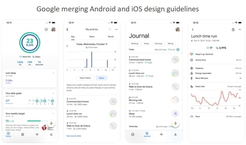
Image credit: App Store, Google Fit (all rights belong to Apple Inc.)
For your health app to operate flawlessly on smartwatches, phones, tablets, desktops, and other platforms, you need to consider:
- Material Design by Google (M3 is its latest incarnation)
- Human Interface Guidelines by Apple
- Web design principles by WC3
Following these guidelines ensures that your users feel comfortable working with your digital product and know what to expect based on their previous experiences in an ecosystem.
Example: Would my health app benefit from having a unified cross-platform design that would look the same on Android smartphones and iPhones?
Accessibility
One thing we can’t overlook with healthcare mobile app design is accessibility. By fully supporting accessibility options built into Android, iOS, WatchOS, and iPad OS, we cater to a broader, more inclusive audience and get fans for life.
Related: Wearable App Development: Everything You Need to Know
Accessibility can be the default mode for your app, or it can work with the corresponding APIs to support alternative appearance and functionality optimized for people with impairment. Apple and Google have made a lot of progress to simplify making healthcare apps more inclusive and accessible.
Some of the top accessibility design strategies include:
- high-contrast colors, avoiding problematic color pairs
- data symbols in addition to colors
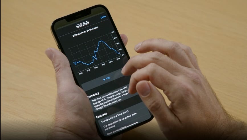
- support for visual and motor accessibility features in your apps
- accessibility options in notifications and complications (on Apple Watch)
- support for motion accessibility options to minimize animations, etc.
- VoiceOver, speech-to-text, captioning, etc.
A good place to start is to check the iOS accessibility guidelines and Android accessibility best practices. Note that both Apple and Google provide additional tips for enhancing your healthcare app accessibility based on your target devices.
Example: Should I integrate with an audio graph API to make charts in my mobile app available to blind and low-vision people so that they can easily read the data and navigate around it? Should I use Google’s accessibility scanner app to identify areas for improving accessibility features in my app?
Security
Security is obviously a big deal for any healthcare software, but what does it have to do with design? Well, first and foremost, security should not stand in the way of ease of use. For example, you can force a two-factor authentication by default and make users enter an additional code every time they log into the app, or you can let them decide if they want this option on or off in settings.
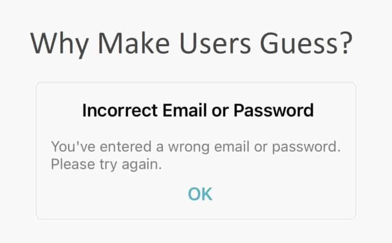
Even though PHI protection is handled chiefly by developers, design, and security do go hand in hand:
- do you explain password requirements explicitly?
- can customers find all security options on a single screen?
- can the app blur out confidential info by flipping their phone up and down?
- do you include PHI in notifications?
- do users understand who has access to their data?
There are actually many UI tricks you can pull when you design a medical app. For instance, you can choose to notify an admin in case there’s unusual activity registered in logs (a doctor signs in from a new device or some weird API).
Example: Do I absolutely have to put my users through a sign-up process before they discover all the options in my medical app?
Performance
Just like security, performance seems to have little to do with design, right? I would agree too, but let’s imagine a patient syncing his glucose readings from a medical sensor to a mobile app. Only specific design mechanics will notify him if the sync is in progress, successful, or if something has gone wrong.
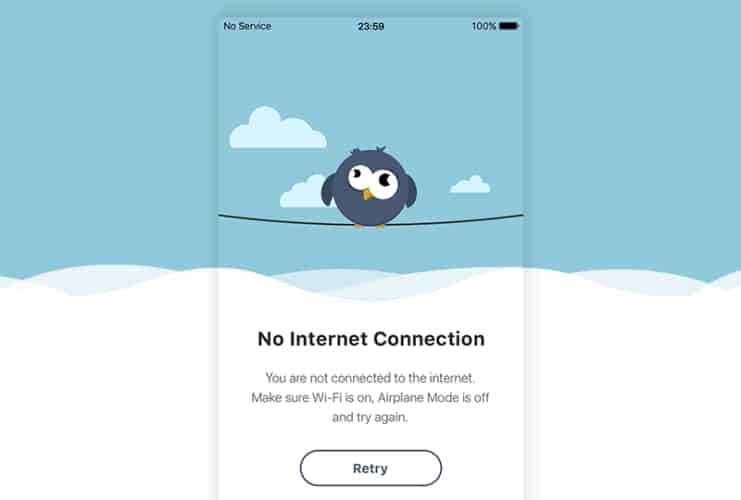
Health data can be critical when healthcare professionals need to make a decision. Therefore, presenting such information in a way that can’t be misinterpreted is of utmost importance. For example, do medical professionals immediately see that patient vitals are outdated or that some data is not being monitored in real time?
As you can see, healthcare app UI design is critical for optimal performance:
- avoid animations that make an app stutter on older devices
- always include clear visual clues for anything critical happening in the background
- provide intelligent error notifications
Example: Should I replace the background intro video for users with a slow connection to decrease the bounce rate on my sign-up screen?
Interactivity
As we’ve established earlier, an app is an interactive experience rather than pretty static screens. And so it matters a ton whether it’s engaging users well enough, so they care to stick around for longer. I’m talking about simple things like screen transitions, micro animations, and pre-populated fields. These small things have a big say in whether your app will engage users or leave them apathetic.
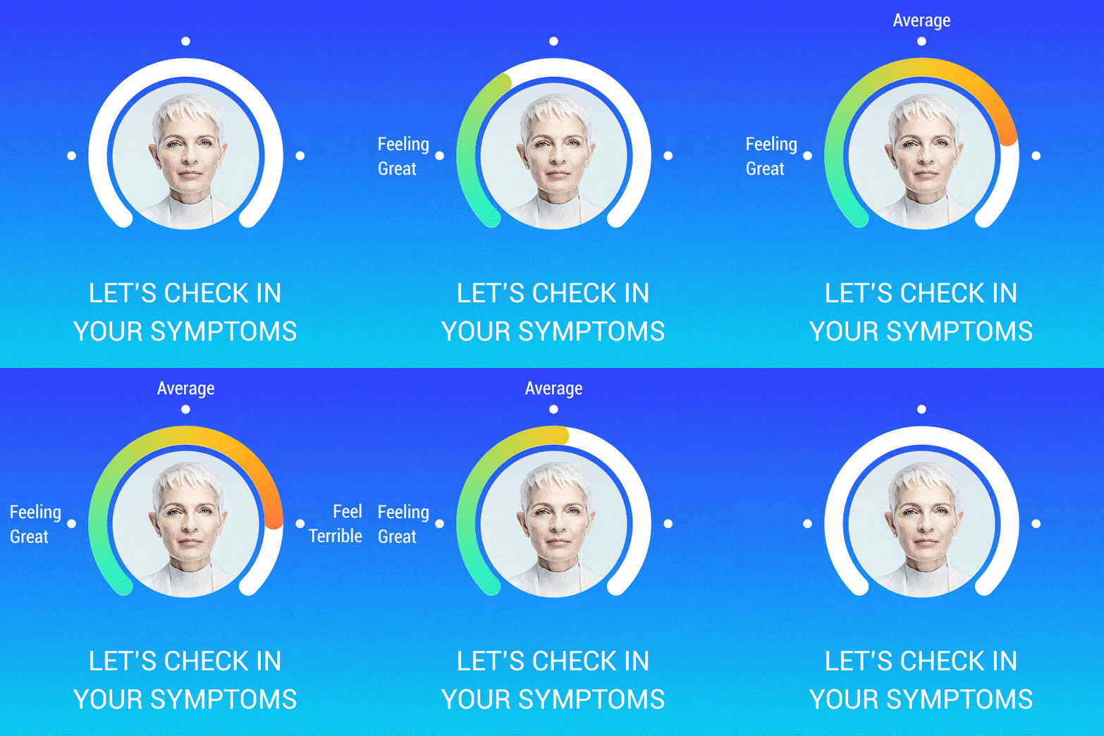
Think about all the UI elements that need to spring to life when the user interacts with them:
- automatic keyboard layout adjustment (e.g., no need for letters when entering a numeric PIN)
- cohesive screen transitions
- 3-tap rule to do anything
- haptic feedback
If you think about other ways to strengthen the emotional connection with your customers, positive reinforcement may come to mind. On-screen prompts that encourage the user to take the next step can go a long way.
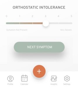
Example: Will my patients appreciate inputting health data by using a slider instead of using a keyboard?
Personalization
Finally, make your health mobile app design feel personal. It’s like this huge overarching trend in the software and technology industries right now.
What can you do to tailor the app’s look & feel to each customer?
- design customizable widgets for the home screen and lock screen
- support dark mode
- display their name
- adjust tappable UI elements based on their age
- optimize for the left- or right-hand usage
Your imagination and knowledge about the target audience is the only limit when it comes to personalization. Remember that your goal here is to help them achieve their goals faster and feel great about it. No need for gimmicking.
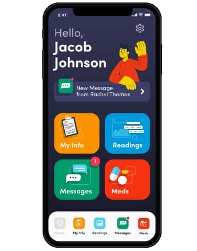
Example: Does it make sense to let my users adjust what they want to see on the main screen? Do I turn on the dark mode according to the phone settings or let them manually toggle it on and off?
The Best Examples of User Interface Design for Healthcare Applications
Design can be very subjective. When you design a health app, you should base your valuation on the target audience’s perception, not your personal preferences. I mean, how can you pick the best medical mobile app design? It’s up to patients, doctors, and other people, using medical applications, to decide, right?
I suggest we do the following. I’ll present a few healthcare apps that have won design awards and a top-ranking medical app and share my observations based on a blitz analysis, OK?
2021 Apple Design Awards
BeMyEyes connects blind people with volunteers who help them with their daily tasks by providing visual assistance.
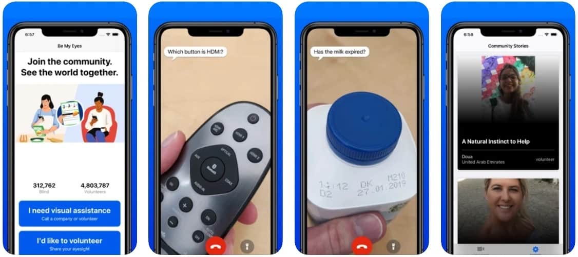
Image credit: App Store, Be My Eyes (all rights belong to Apple Inc.)
Highlights:
- minimum buttons and visual clues
- large buttons are texts
- interactive how-to guide with a simulated user experience
MobileWebAward
COVID Screener is a SaaS consisting of a mobile app for customers and a web portal for businesses. The software helps companies to set up a private contact-tracing app and automate contact tracing.
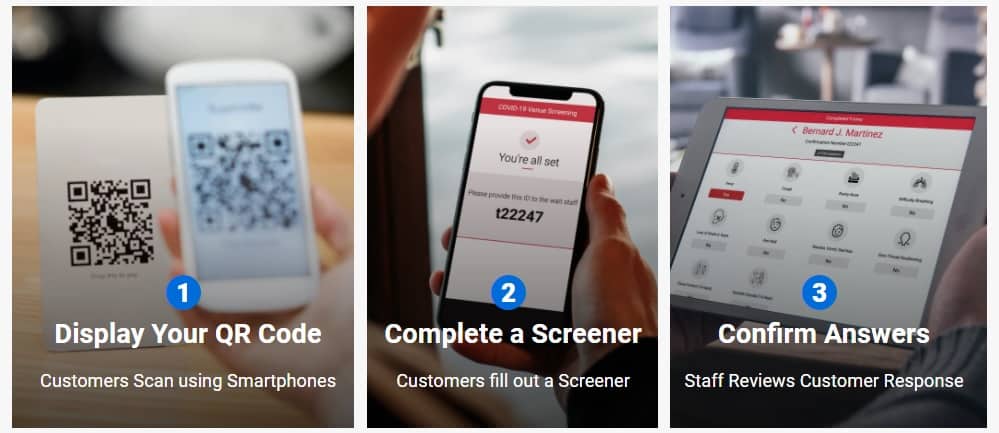
Image credit: COVID Screener
Highlights:
- progressive web app (works via a mobile web browser)
- effective use of colors to communicate screening results
- minimalistic WYSIWYG editor for businesses to tailor their screener
Medical Design Excellence Awards 2021
Digihaler is an IoT medical app that works with an inhaler to measure and record the inspiratory flow rate with each inhalation, share it with doctors, and inform patients about the weather, air quality, and pollen.
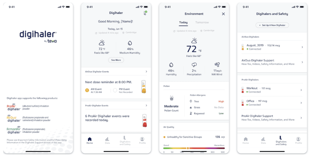 Image credit: Google Play, Digihaler (all rights belong to Google LLC)
Highlights:
- main screen packs a lot of info without overloading users with details
- consistent navigation pattern
- at-a-glance intuitive reports
Related: Telemedicine App Development Guide
iF DESIGN AWARD 2021
Suntory+ helps companies encourage their employees to adopt healthy habits naturally, which leads to reduced medical expenses.
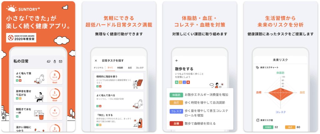 Image credit: Google Play, Suntory (all rights belong to Google LLC)
Highlights:
- rich iconography
- positive reinforcement
- visualization of acquired habits
UX Design Awards 2021
Velieve is a perfect UI/UX case study. This IoT health app connects with a urinary tract infection kit unit and provides remote urine testing.
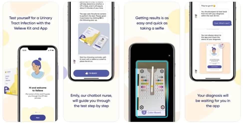
Image credit: App Store, Velieve (all rights belong to Apple Inc.)
Highlights:
- chatbot UI interface
- super minimalistic design
- relaxing color palette
Top-Ranking healthcare app
GoodRx is a popular app for buying prescription drugs at a discount.
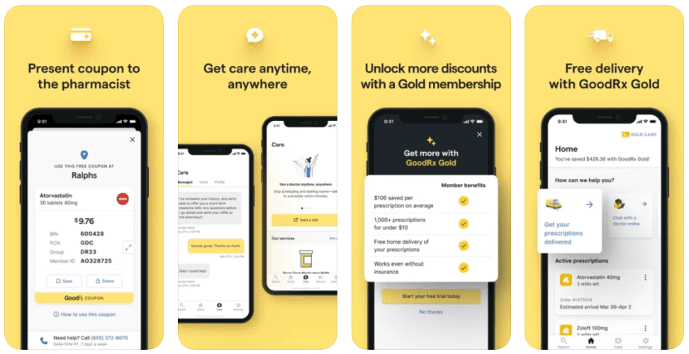
Image credit: App Store, GoodRx (all rights belong to Apple Inc.)
Highlights:
- vibrant, engaging colors
- flat design
- traditional navigation to appeal to a broad audience
Challenges for Healthcare Mobile App Design
What are some challenges you may run into when you design a health app? Let me list a few and suggest potential workarounds.
How to serve a vast audience with a universal design?
Some bespoke medical solutions, for example, apps like GoodRx, need to cater to huge audiences. So how do they manage to keep their designs ubiquitous?
Suggestions:
- Well, first of all, you can allow people to customize their main screen and provide other means for personalization, such as favorites, saves searches, etc.
- Then, think about using neutral colors.
- Finally, build separate apps if the user roles are bipolar, like patients and doctors.
Do we need to optimize our application for seniors?
The importance of design simplicity for seniors is hard to ignore, especially with the quickly aging population in the US.
When designing healthcare applications for seniors, it is important to make the interface as simple as possible. Seniors may not be familiar with technology or may have limited physical capabilities that can hinder their use of a complex application. Optimizing the design for seniors is essential in order to ensure an easy-to-use and efficient experience.
Suggestions:
- Limit complexity with clear navigation paths and buttons
- Use large text size and high-contrast fonts for readability
- Offer visual cues or instructional guidance when needed
- Minimize the number of clicks needed to complete tasks
- Avoid the use of carousels or sliders as they are difficult to control with small targets
- Replace or accompany in-app notifications with text messages
Does skeuomorphism have a second chance?
Skeuomorphism is when a digital UI tries to mimic real-life objects. Imagine a pill reminder app featuring a pill bottle with vanishing pills as the patient marks another intake.
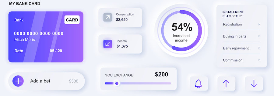 This approach doesn’t always attest to high mobile design quality because Apple long ago trumped skeuomorphic iOS and even fired Scott Forstall (their ex-head of mobile software), who was a staunch advocate of skeuomorphism.
Suggestions:
- if you target seniors, use it
- if you don’t, then don’t use it or double-test before applying
Cultural Considerations?
When making design decisions, cultural considerations should be taken into account. Different cultures have different understandings of colors, symbols and shapes, which can profoundly impact user experience. For example, in many Asian countries the color red means good luck and is often used for things like buttons or progress bars. On the other hand, in some western countries it’s seen as a warning and can be interpreted as an indication of danger. Taking the time to understand cultural nuances related to design will ensure that your product is well-received by users around the world.
Suggestions:
- Understand and research the cultural nuances of the target users
- Consult with medical professionals and local communities to better understand health-related beliefs and needs
- Incorporate visuals, icons, and symbols that are culturally relevant for the target audience
- Allow users to customize their experience based on cultural preferences
- Make sure that there is room for user input with regards to cultural considerations
Too high a cost of mistake?
How do you test a healthcare application and ensure it’s working properly if a single mistake may cause intolerable consequences? For instance, a remote patient monitoring app for glucose readings stops sending data — what do you do?
Suggestions:
- include additional visual keys for non-working features
- account for designing all states of the system
Related: App Development Costs: How to Budget for Your App
9 Steps of Medical App UI Design Process
Now we’ve come to the core of healthcare UX/UI design. We’ll need to go through the following steps to come up with an engaging and visually appealing healthcare app:
- research your target audience
- research your competitors
- Prepare a lean canvas
- work on user stories, and user flows
- design low-fidelity mock-ups and iterate on them
- design high-fidelity mock-ups and iterate on them
- build an interactive prototype using high-fidelity mocks
- test the prototype and iterate on it
- finalize the prototype and prepare design assets for building mhealth apps
As you can see, there are only 9 steps, and they are pretty straightforward. Let’s discuss the activities taking place during each step to better understand the medical UI/UX design process.
1. Research your target audience
The first step is to do your homework and find out everything about your customers and their needs. The more information you have, the better your medical app will be designed. It’s great to understand users’ context of using a mobile product: when during the day and why they use it, etc.

Let me give you an example: if you know that your patients always interact with apps with one hand while holding their phone in the other hand, and your patient app design reflects this, you’ve done an excellent job.
While uncovering more and more details about your customers, you’ll end up creating a customer persona — a virtual representation of the perfect user, with all the traits you’ve been able to discover.
User personas and their needs in medical UX/UI
User personas and their needs are among the most important drivers in medical app design. If you create an app that is tailored to meet the needs of your users, you can be sure they’ll come back for more. Furthermore, user personas will make it easier for you to deliver a personalized experience to your customers.
Creating a customer persona when designing a healthcare app requires effective research and analysis of user behavior. To ensure the persona is accurate, practical steps that should be taken include:
- Researching and identifying key characteristics of potential users (e.g age, gender, level of tech-savvy)
- Creating surveys or conducting interviews to learn more about users’ needs and preferences
- Analyzing any disabilities or special circumstances that need to be addressed within the app design.
- Considering what languages are spoken by the target users.
- Identifying any specific cultural factors that could influence how people use the app such as their religious beliefs or traditional practices.
- Analyzing existing data or analytics from similar products or services within the same sector
- Observing how potential users interact with digital products in their daily lives
- Developing an initial user persona and validating it by asking existing customers/users for feedback
Once you have created a persona, use it as a starting point for all your design decisions. Every feature, button, and interface choice should be created with the needs of the user in mind. This is especially important when designing medical apps, as they tend to require more complex interactions between users and software. Following a user-centered design process will increase engagement and satisfaction with your product.
2. Research your competitors
The next step in the healthcare application design process is to research other healthcare apps that already serve existing customer needs. Read reviews on their apps in mobile stores, install and play with their solutions to spot missed opportunities and ideas worth borrowing.
3. Prepare a lean canvas
Once you’ve done target audience and competitor research, you’ll need to create a lean canvas — a 1-page business model outlining, among other things:
- problem
- solution
- key metrics
- unique value proposition
If you’re working with a healthcare app design agency like Topflight, that’s a good step to engage them and use their feedback to support your progress with healthcare technology acumen.
The medical app UX/UI design does go hand in hand with actual app development, so it’s better to bring on the technology expertise early on and find out how different technologies can limit or propel your healthcare app ideas.
4. Work on user stories and user flows
With the lean canvas ready, you can proceed to map out the primary health app features. One way to do this is to work on user stories (what tasks will the user complete?) and user flows (how does the user progress from one task to another?). Think of this step as a list of features/tasks interconnected with arrows.
5. Design low-fidelity mock-ups
Up to this step, all you have is texts and maybe abstract empty screen sketches. And now it’s this magical moment when UX/UI designers turn this text-based concept into visual design. They mostly start by drawing black and white UI for the main screens.
All you need to do at this step is make sure that the lo-fi mocks accurately represent your concept.
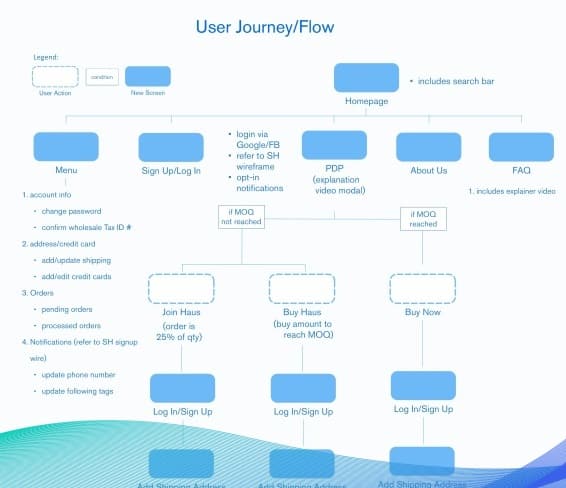
6. Design high-fidelity mock-ups
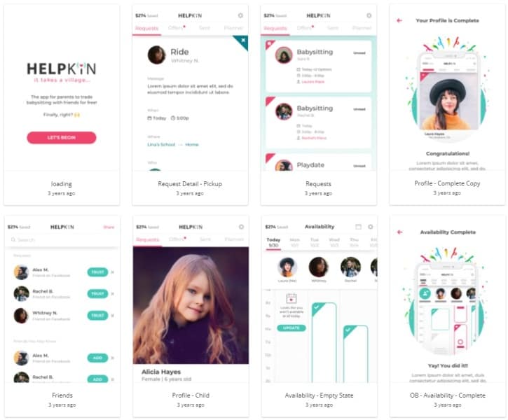
From lo-fi-designed screens, we proceed to put together high-fidelity screens — the ones customers will actually interact with in the live application.
At Topflight, we also involve lead mobile developers at this stage to verify designs from the technical point of view:
- does the design conform to the iOS/Android UI/UX guidelines?
- is it feasible to implement using existing developer tools?
- how will such a design affect the performance of the application?
If the application deals with PHI, we would also have our HIPAA compliance specialists take a look at it and make recommendations.
The artifact of this step is fully designed app screens, including all complementary sections like settings and others.
7. Build an interactive prototype
The prototype phase is the most fun — designers create an interactive prototype using high-fidelity mocks. In essence, they map interactive UI elements on the screens and link them to other screens. As a result, you can jump from one screen to another or interact with on-screen menus by “pressing” buttons and icons.
Thanks to a prototype, you get to interact with your app as if it’s been already developed, when in fact, it’s only been designed.
8. Test the prototype
Testing the prototype is the scariest moment of the whole medical app design process. Services like usertesting.com allow you to select test users that best represent your target audience, and you’ll get to see if your design does what it’s supposed to do.
Test your design assumptions with an interactive prototype in different scenarios and with different user types to make sure everything is functioning as expected. Doing so will reduce the chances of causing frustration or confusion among users due to unexpected behavior or technical issues. With proper testing, you can be certain that your users will have the best experience possible.
It’s worth noting that you can receive feedback as a video feed, comments, or via a survey. For example, if you want to develop a women’s health tracking app, make sure you can actually sit on a call and gather live feedback because it’s precious.
We often find that an initial interactive prototype needs at least a round of iteration before it becomes really intuitive for test users.
9. Finalize the prototype and prepare design assets for the health app development
Finally, after the feedback has been incorporated into the prototype and tested one more time, your hospital mobile app design is ready. One minor step left is to hand over the design to developers. You see, to build a mobile health app, developers will need several sets of screens in different resolutions, fully marked up and explained via comments. Use tools like Zeplin or Avocode to do that.
If you’ve followed all the steps, you should now have a ready design for a healthcare app that has the most potential for generating traction after it’s built and released.
Cost of Healthcare App Design
The cost of designing a healthcare app may range from $15,000 to $30,000, depending on:
- how many screens your mobile/web software includes
- whether your audience benefits more from a custom or default UX/UI
- whether you can reuse some design elements between platforms
You can find out more about our approach to design on the rapid prototyping page.
mHealth Design Best Practices
Now that you know a few things about healthcare app UI/UX design, let’s review a couple of best practices to help you create successful healthcare software.
- avoid combining the doctor and patient UI into a single app — makes it cumbersome and potentially can slog performance, which is part of the UI
- apply 3-tap design strategy with care — users don’t always need to perform any action within 3 taps; sometimes popular apps bury important options, e.g., to make it harder for users to turn off notifications
- add contextual help tips throughout the medical app interface, and add an option to turn that off
- don’t use more than 5 bottom tabs because that makes navigation harder
- account for how the app will look on tablets, smartwatches, and other devices
- consider implementing a landscape mode if you need to display horizontal charts
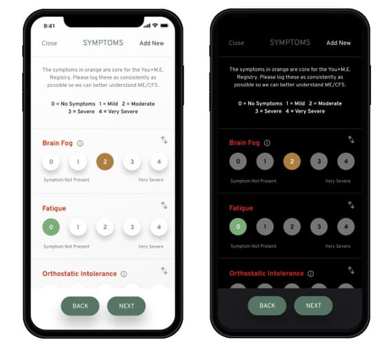
- include the dark theme
- support brand-new features like Siri shortcuts, app shortcuts for quick actions, and force touch for specific actions
- consider implementing a voice-based interface
- remember about the empty-state screens and make them as informative as possible
- minimize the input required from users with default placeholders for fields; adjust the keyboard depending on the type of field the user needs to fill
- keep all critical notifications in a separate window; users should not lose notifications (even after they discard a notification from outside the app)
- go to the accessibility settings, turn on different options, and see what your app looks like to understand how you can adjust it to provide a more inclusive experience for your audience
- use native development tools from Apple and Google to get fine-grained controls over accessibility options unattainable with cross-platform development frameworks
My final advice for designing stunning mobile and web experiences for healthcare applications is to think outside the box. For example, will your customers benefit from zero onboarding when you take them straight into the app without sign-up?
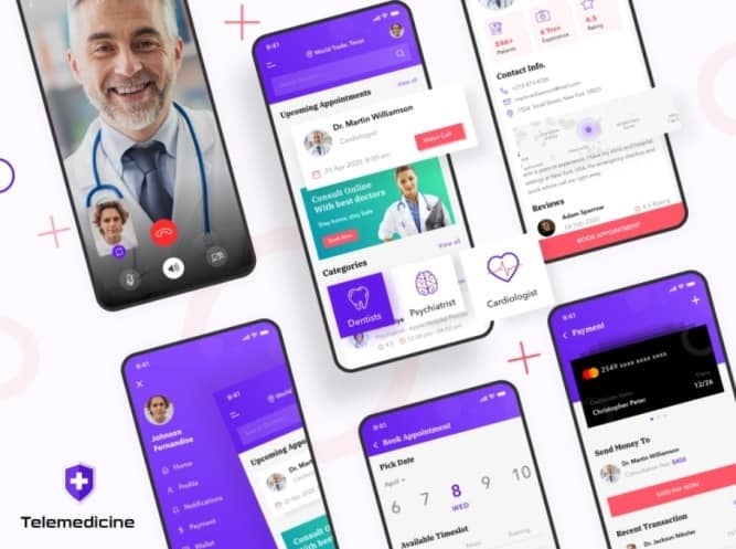
Or imagine a telemedicine app that automatically records video calls, shares them with patients, and provides an AI-driven summary of a conversation in writing once a call has finished. The same telemedicine app can automatically mute your mic when you’re not speaking.
Finally, look at other successful apps and see if you can repurpose their innovative design mechanics for your medical solution. For example, the pull-to-refresh gesture — so common in modern apps — was introduced by Twitter.
I know of a mobile app project where they tried to replace the onboarding survey with Tinder-like yes-no swipes. If you come across an engaging design strategy in one app, think about how that can work in your health app, then let professionals carve it out and test it with real users.
Healthcare App Design Trends in 2023
Let’s see if your healthcare app is on track with the latest health care UX/UI trends. What are these?
Use of native UI elements
iOS and Android constantly innovate data visualization for their platforms, and it behooves a well-designed healthcare app to make use of platform-specific tools like Swift Charts.
Implementing this iOS framework not only helps to consistently display health data across all Apple devices, but you can tap into out-of-the-box accessibility (e.g., voice-over) and localization options. NB, out-of-the-box means no or very little coding is required.
Meaningful use of AR
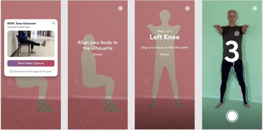
AR technologies have reached the point where we can use them to deliver tangible value to customers. For example, Topflight used AR and machine learning algos in Allheartz to allow patients/athletes and physiotherapists/coaches to reliably assess MSK parameters post injury. At the same time, the design standards for applying this tech haven’t been set in stone yet. Here’s Topflight’s attempt at that:
Haptics
Applying haptic technologies, or micro-vibrations in plain English, can go a long way to draw users’ attention and stress some of the key interactions with software. This implies adding a vibro-feedback in addition to micro UX animations when the user interacts with critical UI parts.
Nostalgia
Whether you target millennials or baby boomers, using nostalgia design tricks can be handy to establish a stronger emotional connection with patients. This approach is reflected in the choice of colors, fonts, and design patterns popular in the 1990s and 2000s.
Dark theme
The app should have it, plain and simple. Customers love how native iOS and Android applications respect their eyes after sunset, and your medical app should not be an exception to this habit.
Data Visualization of Healthcare Data
Visualization of health data is a trend that is becoming increasingly important in the design of healthcare apps. In 2023, data visualization has become an essential tool for helping users quickly and easily understand their health status.
As healthcare providers are able to collect more data than ever before, understanding and interpreting this information can be challenging. In order to better understand patient health trends, many healthcare apps are now featuring interactive graphical representations of health data.
There are several ways to present user’s health data, such as:
- Graphs and charts to display trends
- Interactive maps to show regional differences in data
- Dashboards with an intuitive user interface to surface key insights
- Heat maps to visualize how different parts of the body interact
Design system is a must
Working on robust health care and wellness software like Walker Tracker that spans several platforms and includes a customer-facing web interface, you can’t overlook a design system. Simply speaking, all design elements must be hierarchically organized into a seamless unified system, taking into account all platforms’ specifics.
Our Experience in Medical App Design
At Topflight, we’ve been fortunate to work on all sorts of mobile and web healthcare app designs. Some of the projects required relying solely on Apple and Google’s stock UI/UX libraries. On others, we had more flexibility to appeal to the audience.
Let me just reference a couple of health app design samples that I admire and which got a big thumbs up from customers:
Remote patient monitoring app — part of a large patient registry project.
Clinic’s portal for remote patient management.
Related Articles:
- How to Start a Healthcare Startup
- Integrating with EPIC EHR/EMR
- Guide to Developing a Medical IoT Application
- Doctor’s Appointment App Development
- ePharmacy Application Development
- How to Create a Telehealth Application
- Mental Health App Development Guide
- How to Build a HIPAA Compliant Application
Frequently Asked Questions
How do I move faster through the design phase of app development?
The Agile approach with short iterations should work just fine.
How long does it take to design a healthcare mobile app?
From 1 to 2 months.
How do I keep a leash on the designer's creativity?
Google’s Material Design and Apple’s Human Interface Guidelines.
What do you recommend for prototyping and user testing app design prototypes?
Invision and usertesting.com
What tools can I use for handing over medical mobile app design to development?
Zeplin, Figma, Bit, Sketch, etc.
[This blog was originally published on November 21, 2022 but has been refreshed to keep up with more recent updates]


