When clients ask us how they can save money, or better yet, how they can ensure they validate what they are building first, our answer is to not skip over the early stages of product development which include creating wireframes, mockups, and prototypes. Then we explain the fine-tuned process we’ve refined after iterations of work with our clients, and the tools we use, such as Figma for prototyping, that make this process a lot faster and more cost-effective.
Before diving into the value-nuggets of this article lets differentiate wireframes, mockups and prototypes. Although, if you’re familiar with the differences, you can skip directly to the Figma section.
Table of contents
- The difference between wireframes, mockups, and prototypes
- Why Wireframes?
- Why Mockups?
- Why Prototypes?
- Why Figma?
- Making the most out of Figma
The difference between wireframes, mockups and prototypes
Wireframes
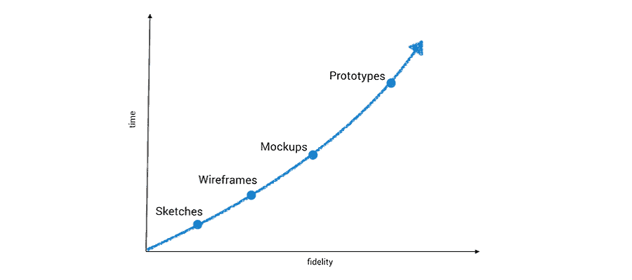
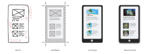
As you look to build any software or product, you’ll want to get some sort of representation before you start the actual building. This is normal in anything you would try to build, whether it is a software or a skyrise building. Regardless of what it is, first you’ll want sketches, then blueprints, and then an architectural model of the actual building.
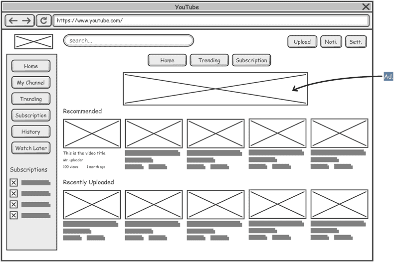
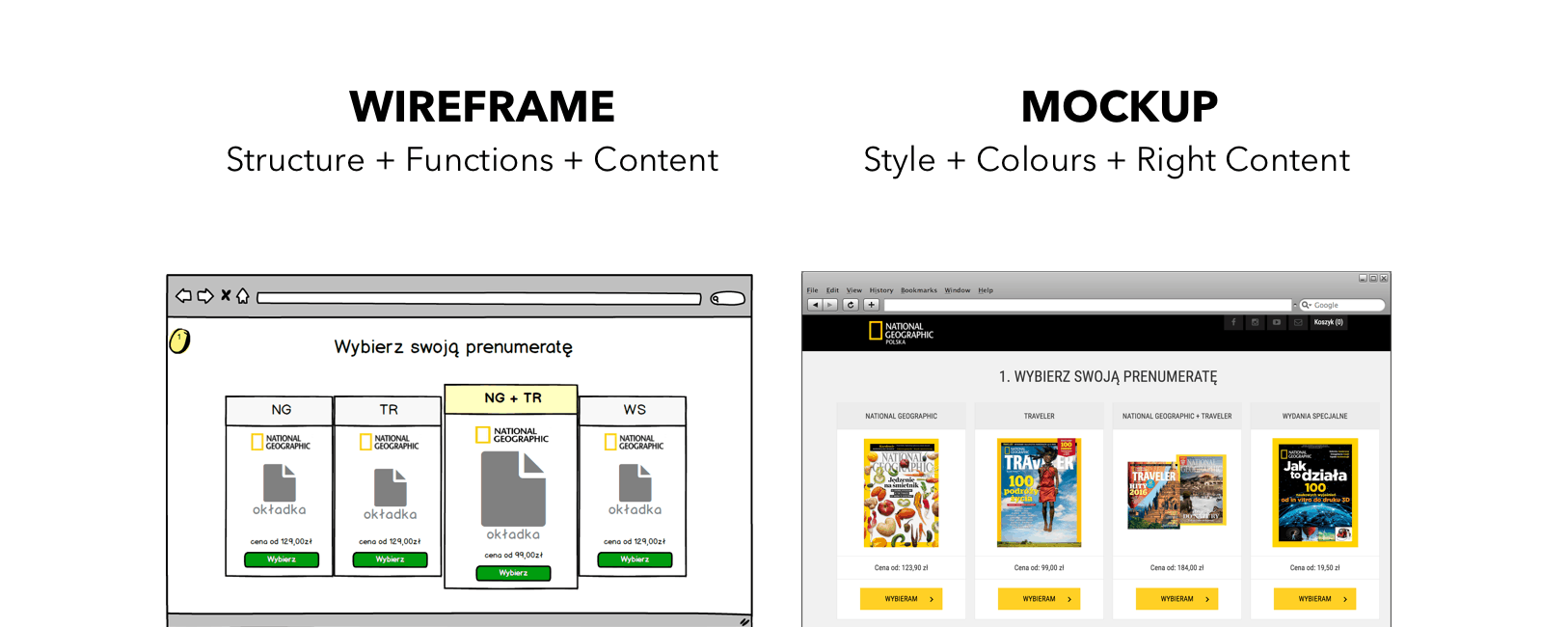
This is where a wireframe comes in as a low-fidelity representation of the initial product concept. It contains the essential elements the product would have without any design applied to it.
It may look like this:
As you can probably tell, a wireframe is a very rough representation of what you’ll be building but helps shorten how long it will take to develop your app.
One thing to remember is that a wireframe is just a blueprint and not a representation of the real screen. Once you get to the next stage, the mockup, effort and time start increasing, which also corresponds to an increase in cost. This is why it is important to spend time visualizing the user journey at the wireframe stage and make the necessary modifications to save both time and money.
Mockup
A mockup is a high-fidelity static design of your future product. It will demonstrate screens or frames, and show the positioning of content and functionality. Unlike a wireframe, this looks more similar to your final product.
A mockup helps to establish the color schemes, content layouts, the brand fonts, icons, and navigational considerations. This is where UI/UX come into play, and integrate branding elements.
A mockup is what front-end developers use to both build out your future product and also provide time estimates for their work. As a quick reminder, front-end work is different from back-end development work, and both are two different time estimates.
If you’re a start-up, then this is what you’ll also use to pitch investors. It allows for potential investors to instantly connect with what you’re building, and demonstrate you’ve thought through things such as design and usability.
Prototype
This final stage is the closest thing you’ll have to what your final product will resemble. It is a vital step if you want to create a successful app while optimizing app development costs.
Since this is one of the last steps before you begin custom developing your app, it also plays an important role to align all team members. For example, a developer can provide feedback on how a certain aspect of UI may need extensive development and the UI designer can propose alternatives. It also offers a chance to make sure data is formatted the way you prefer, such as how you want dates and time displayed. Additionally, you can have field validations considered here too, so you can indicate which fields are required and in what format data should be inputted into the fields.
Luckily, if you used Figma to create your mockups, then you can easily convert it into a working prototype quickly, but we’ll dive more into that later.
Now that we have defined wireframes, mockups, and prototypes above, let’s dive into why these steps are an absolute must if you’re considering building an app.
Why Wireframes?
Build trust with stakeholders
Wireframes play an important role when you’re presenting the system to stakeholders to explain your idea and potential functionality. It allows the first round of discussions to take place, and ensures all of the necessary, or minimal viable product (MVP) functionality is considered. This can be supported by early considerations for usability as well. It allows stakeholders to develop a sense of trust since they know you’re accounting for everything from scratch versus spending thousands of dollars on development without having the basics covered.
Save time and money
The other great thing is that you get a low-cost environment to make quick changes. As you can probably tell based on our earlier discussion on wireframes, elements within the wireframe are easy to create, and certain tools already have the elements pre-made, which allow for easy drop-in to your wireframe. This means you can add, remove, switch, and move items quickly. Again, all of this means you can make changes quickly and for very little cost at this step.
 Why Mockups?
Team Alignment
As teams and companies grow and change, alignment requires persistence to maintain. This is where the ability to showcase the product early on to get constant feedback and buy-in helps. That way nothing is a surprise to anyone since they’ve been involved early on in the process.
It also helps reduce requests later down the line since you’ve gone through cycles of talking through the mockups and various user stories to consider. This is assuming you’ve had multiple meetings here, and have been open-minded about having them too. These early discussions save time and money on the tail end of development, which is why we cannot stress enough to carve out time and a budget for these meetings.
Schedule a 30 minute free consultation
Early User Feedback
As you build your product, one thing you need to be doing is involving users early on in the process so you’re constantly getting feedback.
One way of doing this is through user interviews which is where you discuss their problems and then have users see if your platform would help solve them efficiently. While many things can be said about user interviews, an important thing is to make sure is you’re choosing the right audience. For example, a recipe app like Yummly would need feedback from a very different user base as compared to an app like Robinhood.
Lexicon Alignment
Another thing that these early meetings do is align the descriptions and the lexicon of the product. This way you’re referring to certain pages by the same name, and components or elements as the same thing.
One thing we often experience, even within our own teams that had been working together for years would be calling elements by different names. This is why it is important to align these pieces to reduce confusion and increase productivity. Basically, get everyone on the team speaking the same language.
Design Systems
As web design continues to evolve, one thing we’ve realized is the importance of providing users with a consistent design look and feel. This is where creating a design system is an important aspect of the app design process.
A design system is streamlining and standardizing components of your website to create a consistent look and feel. This consistent look and feel will contribute to the overall brand recognition too. What a design system does is set the foundation for color, typography, grids, texture, elements, and templates of a page.
Mockups help a business setup the early stages of a design system. The other added benefit is that as you go from a web application to a mobile application, you can reuse these elements on the new platforms.
Why Prototype?
After you’ve mocked up a design, if you use Figma, you’ll easily be able to convert the mockup design into a prototype. This will allow you to do plenty of product discovery with your users. The biggest goal here is to learn something at a much lower cost in terms of time and effort before building out the actual product. A prototype will force you to think through a problem in more detail as compared to simply talking a solution through or writing the requirements on a specification sheet.
Usability
One thing many teams assume as they build a product is that they understand what the user needs and believe they know the optimal placement of features on the page.
Oftentimes, when this is tested through usability testing, we find out that assumptions are often different from user feedback. Usability testing is where you put your mockups or prototypes into the hands of users to see how they browse the application and accomplish a job-to-be-done.
For that reason alone, it is great to have usability testing because you’ll learn that a feature you assumed would be significant to the user, in actuality wasn’t that useful to them. The other benefit of finding this out early is the saved cost of NOT developing that feature.
Ideas are often easy to generate. Validating ideas with users isn’t as easy. It isn’t easy because the results can often be tough to accept because they challenge our belief system. Although, this is what creating a software product or start-up is all about – it is about testing your assumptions and failing fast.
This is why we encourage clients to undergo a stage of user testing before moving onto development. It allows them to make sure that the functionalities will be used, easily understood, and designed so they’re as intuitive to the user as possible.
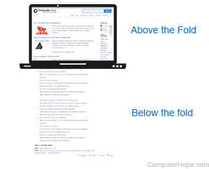
For example, there are different views a user experiences during their browsing, such as before the fold and after the fold. The above the fold is important real estate, and is the best area to prioritize high-value features for the user. Right?
Not necessarily. That’s an assumption.
User testing will allow us to determine if that’s correct based on our particular audience segment.
Learn more about our rapid prototyping process
Perspective Discovery
Whenever you’re building a product, you’ll have multiple people involved from the product manager, UI/UX designers to engineers and researchers. By going through the cycles of developing and discussing these stages, you uncover and align understanding. You’re able to better understand when an action is done on the front-end, certain triggers or pixels need to fire on the backend to help out the marketing or data analytics teams. This way you can have a better understanding of your customer and more precise targeting through ads as well.
Additionally, while you’re building it out, you’ll have essentially four types of questions about your prototype:
- Does this solution offer value?
- Will your user be able to use it?
- How feasible is it to build within timeframes and budget?
- Would this be a good solution for the business itself?
Now that we’ve talked more about wireframes, mockups and prototypes, let’s uncover Figma.
Why Figma?
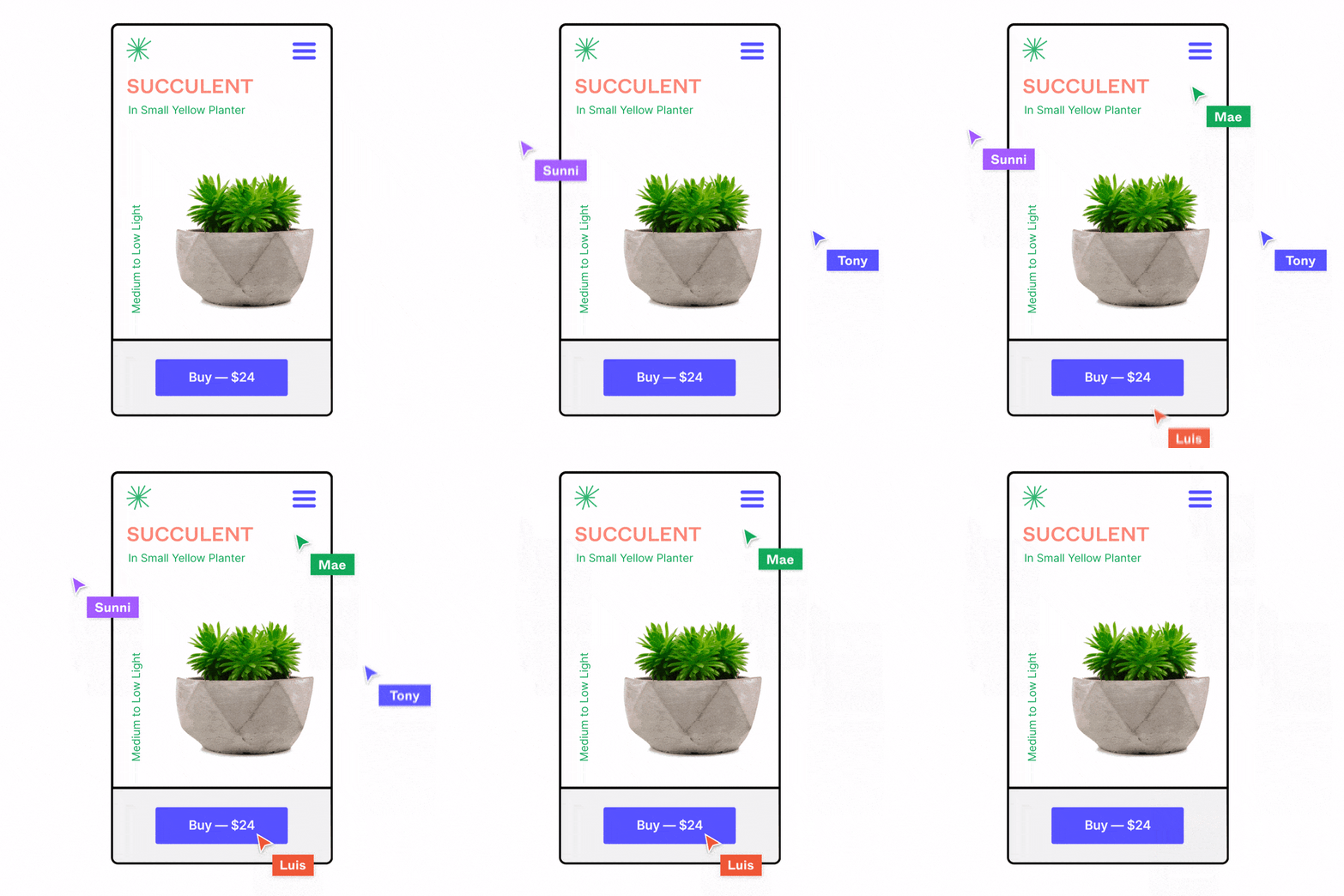
The biggest reason you should be using Figma is their real-time collaboration. This allows multiple people to make edits to the design at the same time and share their visions and ideas. This offers a virtual whiteboard replacement, which is key, especially if teams are remote. But let’s talk more about all the other features that make Figma a great tool for prototyping.
All-in-One Tool
Figma is one of the first all-in-one tools. Earlier if you used a tool such as Sketch, you would then have to use InVision, Abstract or Zeplin to create the prototypes. But now with Figma, you can do that all under one application.
Improved Collaboration
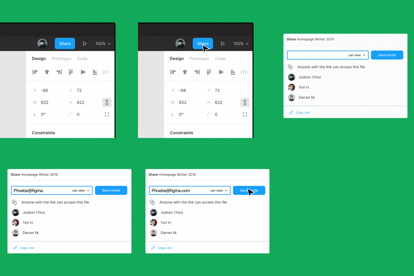
One of the largest benefits of Figma is the fact you can have real time collaboration in modifying and creating mockups and prototypes on the platform. This is especially important when you want to show exactly where to move an object on a screen, instead of trying to describe it either verbally or in written descriptions.
Shared Components & Styles
Two of Figma’s most powerful features are components and styles. They let you reuse UI objects and attributes so you can maintain designs systematically at scale. When you need to change something, like your brand’s link color or home icon, you can make the change once — in the original master component or style — and watch it update across all your designs.
Speed Up Mockups
Another benefit we have seen with Figma is the ability to get on a call, pull up Figma, and the team can start moving around objects on the design to show where we think things should be displayed and how. This to us is the modern whiteboard.
This allows the This allows the team to move fast and mockup new pages within a couple of minutes instead of in days, often without the help of UI/UX designers for these minor edits. Of course, you can bring in the UX/UI designer afterwards to clean up your mockups.
Easy Prototypes
One thing that can be a trouble to deal with other design and mockup platforms is converting a mockup design into a click-through prototype. This is where Figma excels. It allows you to turn your Figma mockups into a prototype in a few clicks.
With Figma you will be able to allow users to interact with your prototype designs through subtle interactions such as clicks or while they hover.
You can easily share it by simply sharing the link. Plus you’re able to have embedded commenting in the prototype which allows you to carry over comments to the design.
All of this functionality allows you to observe a test subject in a UX research session or use it as a presentation to potential investors.
Making the most out of Figma
Use Templates
Everyone wants to speed up the process of developing a product however they can, and one way is on the backs of others. By that I mean by reusing what others have created. In design, this means using pre-made templates.
There are a lot of Figma templates directly on the website or you can find paid Figma templates on Envato.
Either way, you should use templates to start off your design process to save you dozens of hours and plenty of considerations of various elements such as buttons, fields, etc.
Design System
Earlier in the article we mentioned “design systems” which are an essential piece to creating a consistent look and feel across your web and mobile products. A design system focuses on the components first, then works to build the layouts of pages. It is a large change in approach, where you design for variation in viewport (mobile, tablet and desktop) experiences side-by-side, instead of one after the other.
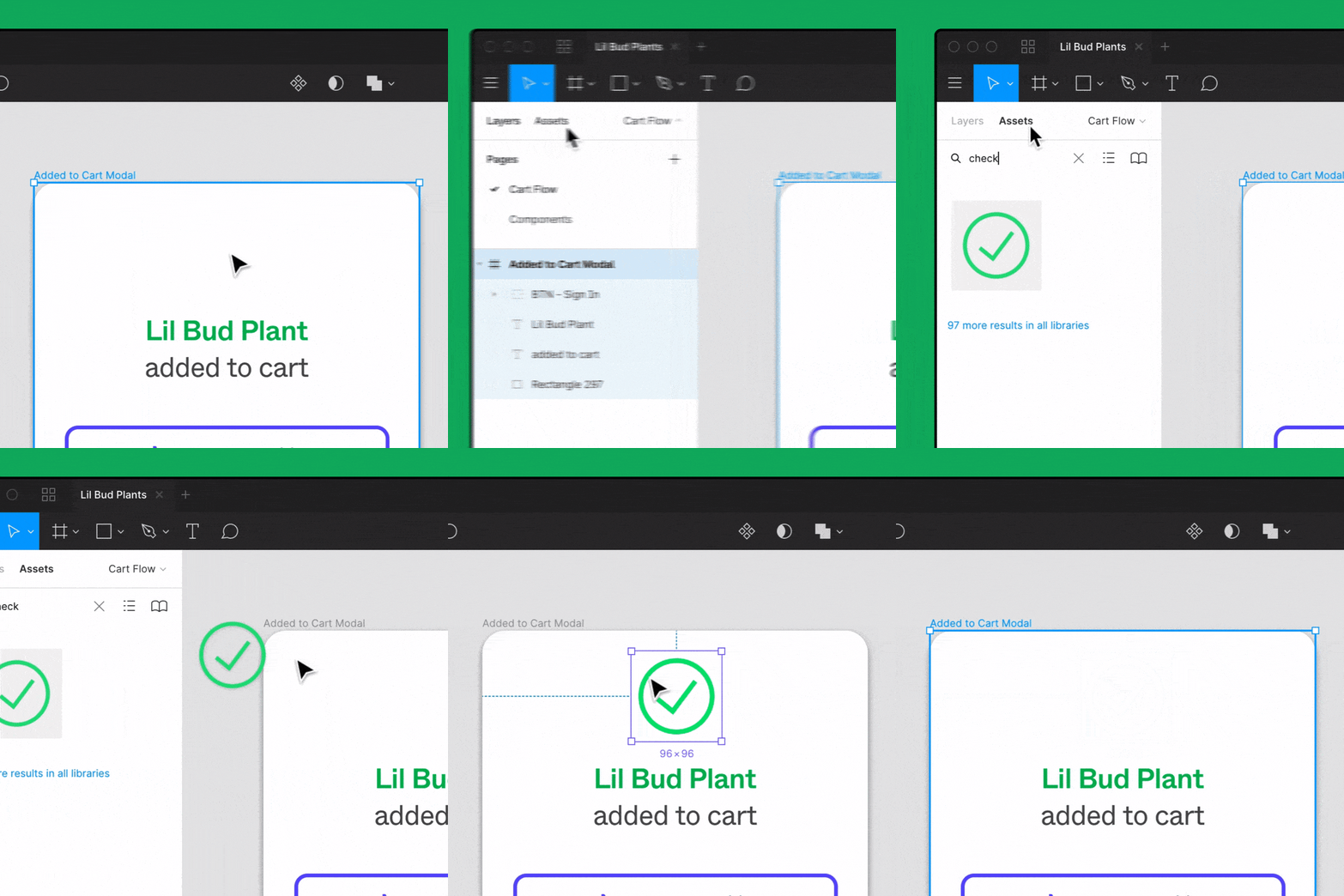
With Figma, it is easy to access all of your assets quickly and insert them into new page layouts. You can easily search or share styles and assets. Then you can centrally locate them for all of your team to access.
The central library created connected elements that can be globally adjusted by simply modifying the master element. This means if you have a box, and you want to round the edges in every instance of it, you only edit the master element.
The reason why creating a design system is considered an optimization is the fact that it allows the team to move faster. They don’t have to guess what a button should look like, how much padding or margin should be above headers, and what call-to-action (CTA) should be used. They can simply place items and create a consistent look throughout the product. While part of a design system is the process, it is equal measure discipline and buy-in from the team.
Conclusion
Before you build any web or mobile application, it is a good idea to wireframe, mockup and prototype it before you actually start building anything. While it may add some cost early on, it will ultimately save you a lot more money and time later down the line. It allows you to get users involved earlier in the process, and iterate your product through their feedback. Before Figma, this used to all be done through several tools in a time-consuming process, but now it can be done under one system while everyone works together.
If you’re considering building an app, or optimizing your existing figma wireframe, schedule a consultation with one of our experts so we can bring your app idea to life.
Looking for help with your app?
in record time with a product that’s set to win.
