
If a product manager or app agency has been sweet-talking you into adopting a mobile-first development strategy for your digital product, and you’ve finally made up your mind to read up on the subject — you’re in the right place.

Spend the next 15 minutes with us, and you’ll be well-equipped to discuss responsive, adaptive, and mobile-first designs with any expert. You will learn if you need to make a mobile-first website and, if so — how to do mobile-first design right.
We’ll also touch on some best practices and explain why the mobile-first design sucks (not a typo). Ready? Let’s roll.
Table of Contents
- Importance of Mobile-First Web Design
- Definition Of Mobile-First Design
- OK, Does “Mobile First” Suck Or Not?
- Principles of Mobile-First Design
- Mobile First vs. Responsive Design vs. Adaptive Design
- Advantages and Disadvantages of Mobile-First Development
- How to Build a Mobile-First Website
- Best Practices in Mobile-First Development
Importance of Mobile-First Web Design
Why are we still talking about mobile-first design today? After all, Eric Schmidt coined the term in 2010, stressing Google’s shifting focus to mobile user experience in their products.
Well, it’s been ten years, and a few things have changed:
- iPhones, iPads, and Apple Watches combined sell 7 times more than Macs
- as of September 2020, Google indexes only mobile-optimized sites
- since 2017, more than 50% of all web traffic has come from smartphones
- we can now browse sites even on Apple Watch

How do you address these challenges? That’s right — by developing a digital product that works exceptionally well on portable devices. And one of the strategies to achieve this is to adopt the mobile-first development approach.
Definition Of Mobile-First Design
I can literally see your brain blowing with, “If mobile is no longer an option, but a must, what makes you say mobile-first design sucks?” Just a little more patience, please.
First, we need to make sure you know the main buzzwords experts are going to drop on you.
Responsive design allows the site to rearrange and/or hide its content blocks based on whether the user is viewing it on a desktop, tablet, or smartphone.
Adaptive design — a separate version of the site, specifically optimized for the mobile experience, served based on what device opens the site.
Mobile-optimized design — any site (or a web app) that looks and works well on a mobile device.

Mobile-first design — a design strategy that implies you start designing your digital product with the focus on mobile design, whereas desktop/laptop experiences follow.
OK, Does “Mobile First” Suck Or Not?
Mobile-first design does suck… sometimes. Its proponents’ central premise is there are too many mobile users, and you can’t ignore them. So start designing your site bottom-up, do not think through the desktop experience first. Instead, cater to smartphone users’ needs and take care of the rest later on, after the mobile version is ready.
Here’s why such an approach is defective in our humble opinion.
Mobile users turn to desktop quite often
When you want to write a long email or comment on a site prototype, and your laptop is nearby, what are the chances you’ll flip your iPhone for a laptop? Would you rather watch a YouTube video on an iPad or TV?
In other words, it’s OK to assume that your product will be used on different platforms, which brings us to the next point.
Digital products span multiple endpoints
I bet most of us at work use laptops and desktop computers with large monitors. In other situations, we may switch between iPads, smartphones, or even smartwatches.

How do you know which of these experiences is most important, and why would you necessarily focus on smartphones first? Does the mobile-first design strategy work all the time? Do people always come to the same site on phones and desktops for the same purposes? The answer lands us on the next point.
It’s a user-first design approach that matters
At Topflight, besides apps, we work on sites that are not regular sites. They are online applications accessible from a browser. So when a client comes and says, “I want you to design and custom build an app that helps people take care of their skin based on their DNA,” we don’t rush into development with the “mobile first” mantra.
Instead, we research the target audience and how they will engage with the product: the context, intentions, etc. Only with this data can we start designing some prototypes, which frankly quite often span the entire device ecosystem: from phones to tablets to websites.

What I’m saying is that we don’t necessarily need to start with the mobile-first design paradigm if we’ve discovered that customers are going to interact with a product mainly via a desktop or, say, tablet (which is also mobile, but not quite — Apple also recognizes that by releasing a stand-alone OS for this family of devices, iPadOS).
User-centric?
To sum it up, we rely on the user-first design strategy. What is it?
User-centric design or user-first design — designing the experience that matters most to end-users, whether it’s desktop, tablet, or phone. When user research proves that the focus must be 100% mobile (and we love it), we embrace the mobile-first design approach.
By the way, this user-first approach applies not only to sites but to software at large.

Disclaimer
As we talk further about mobile-first design here, what we really mean is a particular case of user-first design where we’ve identified that the mobile UX/UI (for this particular application or site) comes first and is crucial to a digital product’s success.
Principles of Mobile-First Design
Let’s say market research shows that your target audience would really appreciate a mobile experience, and you’ve opted for “progressive enhancement” — another clever word for implementing the mobile-first design. You start with a smartphone version and then progressively enhance your product as development moves on to other platforms with larger screens.
What principles do you need to keep in mind when you develop a mobile-first website?
Content
Smaller screens fit less content. So we have to do with what matters most: less (visible) copy, fewer calls to action, smaller images, and more value.
Navigation
The state-of-the-art approach is to hide all second-grade navigation options in a hamburger menu while still keeping the most frequently used sections front and center.

You can pin those at the top or bottom of the site.
Know your tech limitations
Let’s face it: when we take the mobile-first route, we’re dealing with Chrome and Safari. Therefore, we need to make sure that whatever we’re implementing is supported by both browsers.
For instance, if you’re building a progressive web app (a site that looks and works almost like a native app from the App Store), you should know that some things like notifications will not work on the iPhone.
In general, I would count on your development partner to cover for you on this front. Just make sure they know upfront about all potential experiences you envision for your smartphone users.
Mobile First vs. Responsive Design vs. Adaptive Design
Let’s quickly refresh what these UX/UI design strategies entail.
Mobile First is when we design our site for smartphones without simultaneously adjusting its content to a (potential) desktop version.
To make it perfectly clear, we can absolutely design smartphone and desktop site versions in parallel, focusing on mobile first all the while. However, we do not always need to fit the same blocks of content from one version to another.
Responsive Web Design is when we start designing a desktop version and then rearrange and hide content blocks as we proceed with the designs for tablets and smartphones.
Our own site is a good example of a site implemented with the responsive paradigm in mind. The site shrinks and hides some elements as you go from desktop to tablet to smartphone.
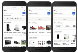
Adaptive Design is one of the instances of implementing the mobile-first design. An adaptive mobile site is a site that has different versions for phone and desktop experiences. Amazon is a great example.
Check out their desktop site:
And the smartphone-optimized site:
If you look closer, Amazon’s phone-optimized site has unique blocks of content, not seen on the desktop version. That’s because Amazon embraces the mobile-first design philosophy and has a completely separate version of the site for smartphones. Their desktop version of the site still responsively adjusts to tablets (shrinking to 3 rows instead of 4), to be fair.
Time to Compare
Now, since adaptive design has turned out to be almost the same thing as mobile-first design, let’s check the difference between mobile-first and responsive design.
Content updates
Responsive: content is updated in a single place and gets in sync across all screen dimensions automatically.
Mobile first (MF): you need to have independent content sources for updating mobile- and desktop/tablet-optimized content.
Google indexing
Responsive: responsive sites get indexed by Google.
MF: mobile-first sites are also indexed by Google. However, Google prefers that your mobile site version has the same content as desktop. Otherwise, you may experience drops in traffic.
Ability to address user needs
Responsive: yes, but not ideally, since most of the time users see less content (even though it is still somewhere inside the site’s structure).
MF: yes, mobile-first designed sites perfectly cater to specific customer needs on smartphones.
Development
Responsive: sites are usually developed with a top-down approach: designers think through how content will adjust for smaller screens, simplifying the larger (desktop) picture.
MF: sites are first designed for mobile, and only then (if necessary) designers start on a desktop/tablet version, which might seem like a bottom-up approach and would be really clunky if it worked like that. Fortunately, the desktop and tablet versions of the site don’t have to reuse the same content blocks from the mobile version with the mobile-first design strategy.

Cost
Responsive: since responsive sites have the same content and a unified architecture (the hidden content that users do not see is still there, in the site’s code), they are quicker, and therefore, cheaper to develop.
MF: mobile-first web development usually takes longer and costs more because you’re developing several sites.
Mobile first vs. responsive summary
Having said all that, I have to stress that mobile-first and responsive web design can absolutely live together, i.e., mobile-first (adaptive) websites can feature responsive design elements.
For example, nothing prevents you from responsively adjusting content on the site if the user rotates their phone and continues browsing in a landscape mode. That doesn’t happen often, but technically speaking, responsive elements can be realized in an adaptive (aka smartphone-first) site.
What’s more, you can even design a mobile-first website by applying responsive design principles at full scale. This means the site would have a single version, and its layout would adapt to the screen size.
The only difference is you would start designing such a site bottoms-up: minimized layout first, tablet and desktop layouts second.
In the end, you are creating a mobile-first responsive web design: a responsive site designed within the mobile-first design paradigm. Makes sense? Schedule a call, if not.
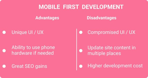
Advantages and Disadvantages of Mobile-First Development
We’ve already kind of touched on that in previous sections, but let’s summarize the benefits of mobile-first development and outline where it falls short:
How to Build a Mobile-First Website
I’ll say it again: we don’t build simple sites in our company. Instead, we focus on web and smartphone applications. Therefore, for us, the mobile-first design approach comes second, even though many consider us mobile-first developers.
We stick with the user-centric design paradigm that guides us to discover user needs first and then create the corresponding experiences, whether it’s native apps for tablets and smartphones, mobile sites, or everything else.
At the same time, if the market research shows that our client really needs a mobile site (say, to accompany their health-related, investment, or insurance desktop platform), we have a couple of tricks up our sleeves to craft engaging mobile experiences.
Accelerated Mobile Pages
Long story short, these are Google-supported specially designed site pages that load unbelievably fast and may even be stored in Google’s cache. They work best for marketplace sites and other copy- and photo-heavy pages, but not for dynamically built pages that need to feature graphs, etc.

Progressive web apps
Sometimes it makes sense to present your site in the form of a smartphone app. It’s still JavaScript and other web technologies behind the surface, but the important thing is your customers get a unique mobile experience.
That may include some limited use of phone hardware, like geolocation, camera, and notifications (Android only) as well.
Good old JavaScript and HTML
If you’re going after pure web experience, and your site doesn’t need to carry any app attributes, all you need from a technology perspective is HTML, CSS, and JavaScript. In this case, you’re building a simple mobile website.
Best Practices in Mobile-First Development
When you create a mobile-first website, you need to be aware of quite a few things that come naturally for app developers but may not always be evident to web designers. How does mobile-first UI/UX design work?
Remember the inputs
We operate our phones with fingers, not pointy mouse cursor, and you have to account for that in your design:
- no hover-over effects
- larger buttons and forms
- forms broken into several steps
Remember the platform
You can tap into some of the iOS and Android capabilities:
- link phone numbers and addresses to make phone calls and go to maps
- add deep links to specific parts of your native app (if available)
- use Apple’s USDZ files to preview 3D objects in augmented reality

Remember about the screen size limitations
Smartphone screen sizes, despite growing every year, still cause some limitations to making site features mobile-friendly:
- replace the navigation bar with a hamburger menu, leaving 1-2 most viewed sections intact
- use collapsible blocks to keep more content while reducing the visual load on users
- place clickable elements within the natural reach of thumbs
- optimize images and videos for faster loading
Your Takeaways From Mobile-First Design Strategy
If you take anything at all from this blog, take this:
- Mobile-first design will take longer and cost you more than a responsive website, but that may be well worth it.

- Your satisfied customers will make up for the higher app development costs because their experience will be exceptional, and they will stick around longer.
- You don’t need to rely on the mobile-first design strategy all the time.
- The user-centric design approach is your answer to crafting genuinely engaging digital experiences, regardless of the platform (smartphone or desktop).
Mobile first is a design strategy, and you apply it when you know most users will flock to your product on smartphones. You may still be thinking through the desktop and tablet experiences while you’re working on the handheld version, and those larger-screen experiences may be responsive or adaptive. It doesn’t matter. If you focus on the mobile experience first, you’re sticking with the mobile-first design.
It always helps to explain these intricacies with an example. So if you have a digital product in mind and need help with understanding how mobile-first design may apply to it, schedule a call with one of our consultants.
Related Articles:
- A Guide to App Design Cost
- How to Redesign an App
- Healthcare App Design Guide
- App Development Costs: The Complete Guide
[This blog was originally published on Jan 3, 2019 and has been updated for relevancy]
Frequently Asked Questions
How do I choose between mobile-first, responsive, adaptive, and mobile-optimized design patterns?
Mobile first, adaptive, and mobile-optimized often mean the same thing. You need to research how customers will use your digital product and let their needs guide you. If they are likely to use your site for the same purposes on desktop and smartphone — responsive design is a clear winner. If they need specific on-the-phone experiences, you pick the mobile-first design methodology.
How much does it cost to build a mobile-first site?
$30,000 — $40,000 based on your requirements, but please note that we do not develop simple websites unless they accompany an app.
What is the main difference between adaptive and responsive built sites?
An adaptive site has at least two separate versions for itself. One is for desktop and tablet devices, and one is for phones. A responsive site is the same thing that adjusts layout dynamically based on the screen size: it normally shows less content on smaller screens.
Does the mobile-first design approach only apply to sites?
No. Your target audience may be craving mobile experiences either in the form of mobile sites or native apps. In case their needs can be addressed with a mobile site, you can also opt for a progressive web app — a website that mimics a native app.
Do you not recommend using responsive design?
Not at all. Our site is responsive. If your site mostly serves marketing purposes, chances are a responsive website is what you need.