App redesign is a tough decision because it always starts with business owners admitting they need a change. When an app’s business metrics are out of whack, there are not too many options on the table:
- throw the app away
- redesign the app
- rebuild the software
Firing off an app redesign process seems like a no-brainer, huh? Yet, how do you approach that without irritating customers? What are the steps exactly? Which best practices to follow? What mistakes to avoid? How much to budget? There’s so much to learn about how to redesign an app.
Keep reading to find answers to these and many other app design-related questions.
Top Takeaways:
- Start an app redesign only after identifying current inefficiencies, prioritizing all changes, and aligning them to your ROI goals.
- To get the best results, back up your mobile app redesign efforts with data analysis. To get that going, integrate an analytics platform into your application and set it up to track in-app engagement metrics.
- Keeping the existing UX/UI that already works perfectly is as vital as refurbishing the rest of the app.
Table of Contents:
Reasons For the App Redesign
Benefits of Redesigning Your App
App Redesign Case Studies
3 Steps to Redesign an App
- Step 1: Analyze the Existing Design
- Step 2: Redesign the App from low-fi mockups to high-fi prototypes & Test It
- Step 3: Implement the Redesign
Top Mistakes of the App Redesign Process
How Much Does It Cost to Redesign a Mobile App
Popular Tools for App Redesign
Reasons For the App Redesign
If you’re thinking about redesigning your application, it must be for one (or a combination) of the following reasons:
- your app’s metrics are dwindling down
- your customers are voicing their irritation through reviews and support inquiries
- your business is undergoing a rebranding
- you want to introduce new features that may break the existing design
- you haven’t updated your app for months and want to re engage your audience
- you want to leverage the most recent OS software/hardware updates
- you decided to switch to a new target audience
Of all these reasons, only rebranding is relatively straightforward and light on the budget. Typically, such a UI redesign would entail just changing a logo, main color palette, and fonts. Nothing too fancy.
As for other cases, I want to make it clear that they also involve development besides design. When we redesign an app, we modify not only its UI (how users perceive it) but also the UX (how users interact with it). And that means some coding is in order.
The bottom line is that we redesign apps when they no longer effectively serve our business purpose. Obviously, keeping customers happy is a huge part of this. And chasing the latest design trends is definitely not part of a sound app redesign strategy.
Benefits of Redesigning Your App
Ideally, you start toying with the app redesign idea after trying everything else: adjusting pricing options, ad copy, content updates, etc. Because that means that a redesign is the solution you’ve been looking for, or else you’re running an unsustainable business.
What are the upsides of redesigning an app?
- the software helps you reach your business goals
- loyal customers become your brand ambassadors and onboard new users
- you reach wider audiences
- the overall brand perception improves
I mean, anything will do as long as the software delivers on the projected ROI once updated, right? Otherwise, why bother?
App Redesign Case Studies
We have quite a few apps in our portfolio where the major effort was to redesign existing user experiences. It’s not like our partners came to us with the apps to redesign. Instead, we arrived at this conclusion after carefully examining the applications.
Related: How to Manage Design Debt
Walker Tracker
Walker Tracker is a digital wellness platform allowing businesses to run engaging step-counting challenges and other healthy activities for their employees.
The company’s Android app had long suffered from poor ratings and negative user reviews, making it harder to onboard new customers and achieve higher traction.
What we did: one of the major tasks was to up the app’s rating in Google Play, which we did: from 2 stars to 4.6 stars.
Tools used: Mixpanel, Google Analytics, Amplitude, Crashlytics, Figma, Invision.
Results: successful acquisition by Terryberry, Web Excellence Awards Winner, Gold Stevie Awards Winner.
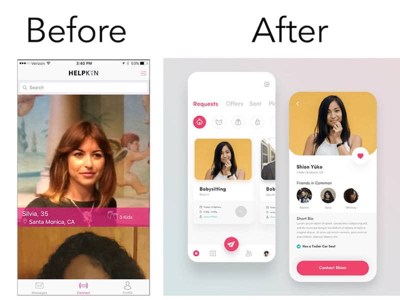
Helpkin
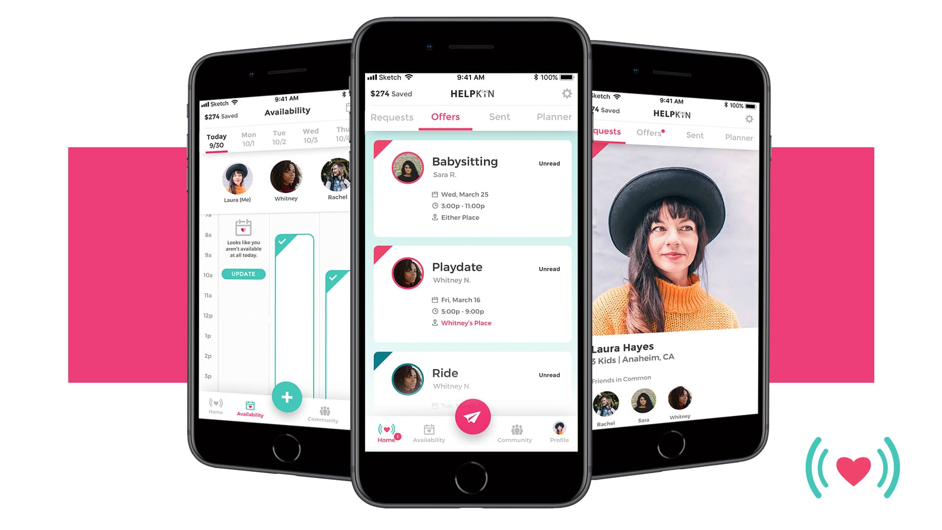
Helpkin takes a unique approach to service sharing between friends. The main idea of Helpkin is to get and give help from and to the people you trust most. The application was designed for the busy mom and dad of fur babies or children who wanted to reclaim a date night.
What we did: completely overhauled the app’s UX/UI to make it light, not visually overwhelming, and playful at the same time.
Tools used: Inapptics, Firebase, Sketch, InVision.
Results: successful acquisition.
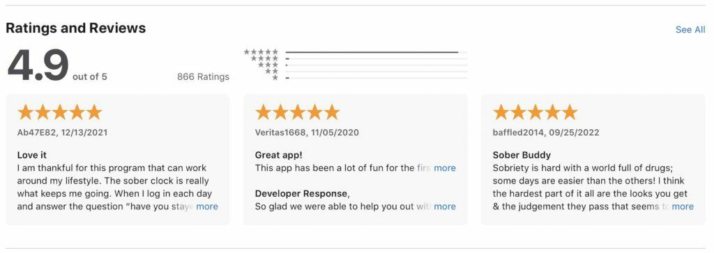
Soberbuddy
Certified addiction specialists Paul Brethen and Tara Schiller co-founded SoberBuddy, an evidence-based drug and alcohol recovery chatbot to support people suffering from drug and alcohol abuse.
Our job was to take over a shaky prototype from the previous team and turn it into a thriving commercial app.
What we did: redesigned and rebranded a mobile chat, helping to iterate on the app’s mascot. One of the major issues was a low retention rate and conversion.
Tools used: RevenueCat, Sentry.io, Figma, Invision, Google Analytics.
Results: increased the mobile store rating from 3 to 5 stars, increased user base and app store reviews by 10x, and reduced acquisition cost by 50%.
Now that you have some examples of redesigns, it’s time to discuss how to redesign a mobile app through a series of specific steps.
3 Steps to Redesign an App
As mentioned above, app redesigns may include just the brand updates or more significant changes to functionality. And if rebranding is relatively straightforward and revolves mainly around switching colors, fonts, and logos, a more thorough redesign is a complex process. What should you expect in the latter case?
Here’s a quick overview of the app redesign process:
| Step | Description | Key Actions |
|---|---|---|
| Step 1: Analyze the Existing Design | Identify flaws in the current UX using data and feedback. | Integrate analytics tools, process app store reviews, gather direct user feedback, and analyze competitors’ designs. |
| Step 2: Redesign the App | Address identified issues through iterative design processes. | Create low-fi mockups for internal testing, high-fi prototypes for external testing, and verify design feasibility with developers. |
| Step 3: Implement the Redesign | Apply the new design to the app and ensure quality through testing. | Use agile sprints for implementation, involve QA for validation, and monitor user feedback post-launch. |
Step #1: Analyze the existing design
So it’s pretty obvious that we first need to uncover the flaws of the current UX design, right? How do we do it? We always talk to our customers.
In general, designers’ hunch is fine to rely on, but only as the starting point that needs to be verified with data. You want your new design to be data-driven because when you can measure something, you can improve it.
Mobile analytics
If your software doesn’t already include built-in analytics like Google Analytics or Mixpanel, your first step is to integrate with such a service. This is necessary to find out at what point of their journey customers drop off or have other issues with the app, how they use the software in general, etc. These analytics platforms can track many useful user engagement metrics to keep your app healthy.
Customer reviews in the App Store/ Google Play
Processing user reviews from mobile stores is a must. Just remember that people will help you identify the most glaring problems, and you might need to follow up with them to discover the rest of the issues.
Direct user feedback
I wouldn’t include polls in a mobile app because that distracts people from using the application even more. Find other ways to communicate with your customers and offer them something in return for their valuable feedback.
Of course, that implies that you rely on solid user research and clearly understand your ideal customers and their pain points.
Check on competitors
See if people are raving about competing products in the App Store, and then check out their designs for inspiration.
Related: Mobile App Design Guide
Step #2: Redesign the app
Once you’ve identified the issues, it’s time to design. Now you know what parts of the app need improvements, whether it’s confusing navigation, a cluttered home screen, uncommon gestures, etc., and you’re going to fix this.
Low-fidelity mockups and internal testing
Designers should first work on low-fi mockups recreating the updated user journey. This low-fidelity design should be tested internally by stakeholders and maybe verified with a small customer focus group.
Considering smart watch app development at this stage ensures that the redesigned interface also works seamlessly on Wear OS devices.
You also need to check with developers at this point whether the updated design will require substantial effort. Ideally, we’re going after the low-hanging fruit, but that depends on your situation, of course. You may be surprised, but coders often come up with sound ideas around design.
Redesigning an app with the help of a custom mobile app developer can breathe new life into your user experience.
High-fidelity mockups and external testing
The low-fi mockups now turn into a polished design version. At this point, it’s time to compile a rapid prototype — a clickable “paper” app version. A prototype has zero code (your CFO will certainly appreciate it) and, at the same time, allows testing the redesign with customers using such tools as usertesting.com.
Ideally, after testing the prototype and going through a couple of iterations, you have a yes from end users, stakeholders, and developers. And now, it’s time to implement the new design.
Step #3: Implement the redesign in the app
Without going too much into detail, this step is when coders apply the redesign for a mobile app.
Rapid iterations
In a perfect world, you are working with an agile team that plans development sprints (aka assigns and tracks completion of tasks every two weeks) and delivers updates on a regular basis. Such an approach guarantees you faster time to market.
Testing
It’s worth noting that QA engineers are a big part of this process, too, as they need to verify the updated UI/UX and ensure programmers don’t break what was already working.
Also Read: The Complete Guide for QA Testing
Maintenance
Finally, you will need to monitor user behavior and feedback after launching the redesigned app. Again, using services like Mixpanel will help you stay on top of things.
It helps if your development/design partner has earned some hands-on experience in your niche. For example, redesigning of a wellness/fitness/healthcare solution implies intimacy with health app design.
Top Mistakes of App Redesign Process
How can you sidestep the most common pitfalls while redesigning an app, and what are these pitfalls anyway?
No budget for development
As you already know, we need to apply new designs to the app’s code when we redesign mobile apps. So ensure you budget for this in advance.
Also Read: App Development Costs: The Complete Breakdown
Slowly, then suddenly
Some agencies may offer a slow redesign when certain elements are gradually replaced throughout the app. That may work if you need slight changes. However, typically this approach breaks the user experience and unnecessarily increases a development budget.
I just need a talented designer
As you noticed, you’ll have to work not only with designers, who admittedly impact a redesign process the most, but also with developers, testers, and business analysts.
Cushion the blow for OGs
Only a few customers embrace changes, and some may have already come to terms with the existing design. So consider adding a tutorial, context help, and other means to help them grow accustomed to the fresh design.
Organize design assets into a design system
Use the existing UI design artifacts and combine them with new assets into a coherent, fully annotated design system. As a result, developers will spend less time implementing the designs, and any further changes will happen faster.
Don’t break what already works
As you remember, we approach a mobile app redesign project by assessing its design, looking for flaws. Well, it’s also essential to identify early on what really works nicely for users. Apparently, this effective UX/UI needs to stay intact during the redesign.
Release for a limited audience
Maybe roll out to a few specific geos to battle-test your design assumptions before going live for all customers.
How Much Does It Cost to Redesign a Mobile App
It goes without saying that every redesign project is unique, and so budget requirements differ from one application to another. Still, if it’s not pure rebranding, you can expect to spend on a redesign of an application in the range of $30,000 to $60,000.
So make sure you prioritize the design changes by their value to customers and, correspondingly, the impact they will have on the ROI. Starting with a low-hanging fruit seems a no-brainer.
Again, keep in mind that you will need to unify all the existing and new design assets into a cohesive design system to offset the cost of any future changes.
Related: How Much Does It Cost to Design an App
Popular Tools for App Redesign
There is certainly no shortage of proper tools on the market for designing mobile and web apps. We find ourselves mainly working with Figma and Invision, besides the pro software like Photoshop or Illustrator. Figma has been especially helpful in streamlining the design-to-development hand-off process.
Some other popular choices include Sketch, Adobe XD, and Marvel. There’s no silver bullet solution, though. Each team applies the tools that worked best for them and their clients in the past.
If you’re wondering how to apply the three-step application redesign strategy to your product or have other questions about redesigning an app, reach out to our experts today.
[This blog was originally published on 10/19/2022 and has been updated for more recent content]
Frequently Asked Questions
How do I know my app needs a redesign?
The chances are it doesn’t. If you haven’t studied any app performance metrics and therefore haven’t seen any decline in user activity, you might do away with the redesign. If you just saw a fresh-looking competitor and thought your product looks outdated, that’s just emotions, and it’s normal. Go check the app usage data first.
If my app is available for iOS and Android, does that mean I'm actually redesigning 2 apps?
Yes, and no. Depends on how much your Android and iPhone app relies on stock design elements. If they feature custom designs without stock user interface elements, then yes – you will need to redesign two apps.
Are there specific design tools to which I should pay particular attention?
Anything your design team is comfortable with should work, e.g., Invision, Figma, Sketch, or similar tools.
How long does it take to redesign an application?
It totally depends on how many screens/ states your application has. Can be up to seven months sometimes. The important thing here is to focus on delivering value. Who cares if it takes you six months to update the app if you’re nurturing a revenue-slaying monster?
What experts will I need to successfully deliver an application redesign process?
Much like with app development, you will need developers, designers, business analysts, project managers, and product managers. Designers will be the core of the team, but a successful redesign is impossible without the rest of the team.
